Stunning lightbox effect (that anyone can install)
Install
If you're using one of these platforms, click your platform and follow the instructions to install the Magic Thumb module: If you're not using one of the platforms above, install Magic Thumb like so:- Download the Magic Thumb demo.
- Unzip the file on your computer and FTP the magicthumb folder to your website directory (on your server), keeping the file and folder structure intact.
- Reference the JavaScript and CSS files before the </head> in your page. Example:
<link rel="stylesheet" href="magicthumb/magicthumb.css">
<script src="magicthumb/magicthumb.js"></script>
(If you cannot access the head section of your page, reference the files elsewhere such as the main content of your page.)
- Link your small image to your large image with a class of MagicThumb. Example:
<a href="big.jpg" class="MagicThumb"><img src="small.jpg" alt=""></a>
<html>
<head>
<title>Magic Thumb example</title>
<link href="magicthumb/magicthumb.css" rel="stylesheet">
<script src="magicthumb/magicthumb.js"></script>
</head>
<body>
<a href="big.jpg" class="MagicThumb"><img src="small.jpg" alt=""></a>
</body>
</html>
Position
The image will enlarge into the center of the screen by default. You can change it to enlarge over the small image using expandAlign attribute.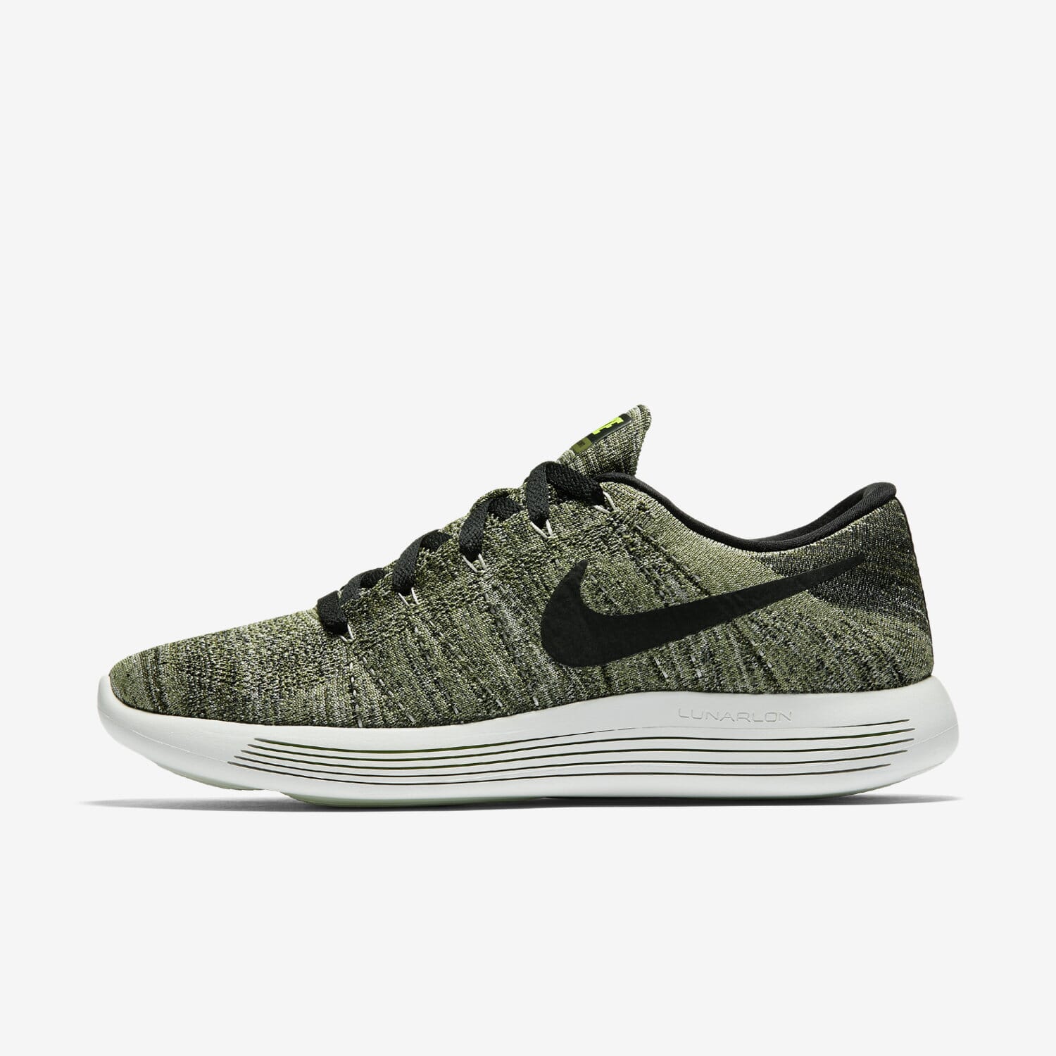
<a href="big.jpg" class="MagicThumb" data-options="expandAlign:image;"><img src="small.jpg"></a>
Effect
Choose from two effects to enlarge the image.- Expand - large image will enlarge from your base image.
- Fade - large image will appear smoothly without enlarging.
<a href="big.jpg" class="MagicThumb" data-options="expandEffect:fade;"><img src="small.jpg"></a>
Easing
You can change the effect to all sorts of behaviours by using the expandEasing setting. Make it exactly how you like by choosing your favourite bezier curve options at cubic-bezier.com.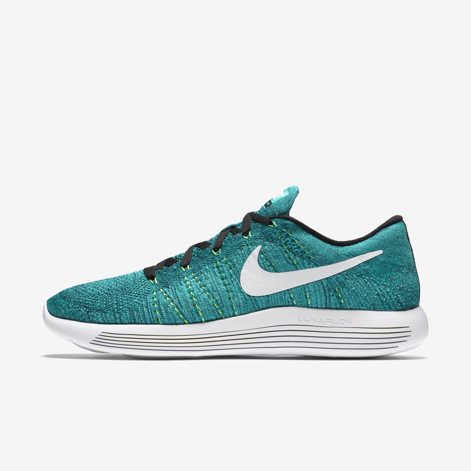
<a href="big.jpg" class="MagicThumb" data-options="expandEasing:cubic-bezier(.09,.63,0,.99);"><img src="small.jpg"></a>
Trigger
Change your Magic Thumb to open on hover instead of on click. Set the expandTrigger option to hover: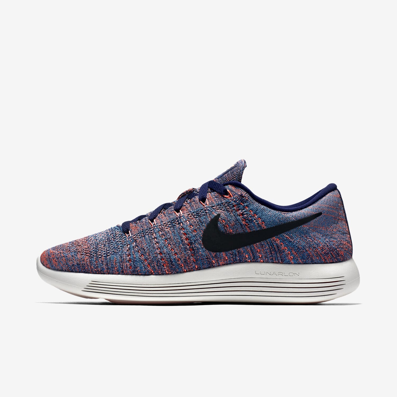
<a href="big.jpg" class="MagicThumb" data-options="expandTrigger:hover"><img src="small.jpg"></a>
Content
Magic Thumb works with HTML elements, so you can link to URLs, add captions and create text with links.Link to URL
Normally, clicking the enlarged image will close it. Instead, the enlarged image can link to another page by applying thelink parameter, for example:
<a href="big.jpg" class="MagicThumb" data-options="link:http://www.example.com;"><img src="small.jpg"></a>

<a href="big.jpg" class="MagicThumb" data-options="link:http://www.example.com; linkTarget:_blank;"><img src="small.jpg"></a>
Caption
Add titles or detailed descriptions to your enlarged images. There are 3 ways to add text:- title - fast and easy; good for text only.
- alt - fast and easy; good for text only.
- span - advanced control; for adding any HTML formatting.
<a href="big.jpg" class="MagicThumb" title="Caption displayed using title code"><img src="small.jpg"></a>
<a href="big.jpg" class="MagicThumb" data-options="captionSource:alt;"><img src="small.jpg" alt="Caption displayed using image alt tag"></a>
<a href="big.jpg" class="MagicThumb" data-options="captionSource:span;"><img src="small.jpg">
<span>Caption displayed using span tag. Here is some <strong>bold text</strong> and <em>italic text</em> and [a href="example.html"]here is a link[/a]</span>
</a>
You can position the caption to the right of the image by setting captionPosition:right. Here is a long, detailed description applied to the image:
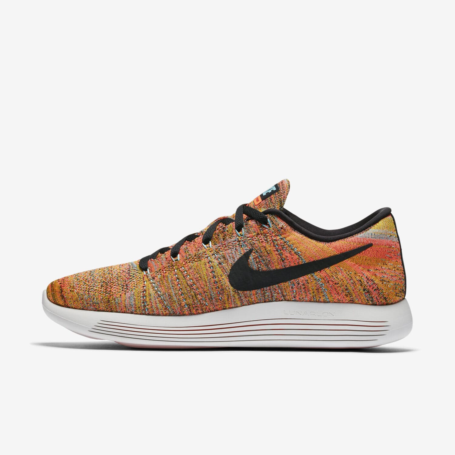
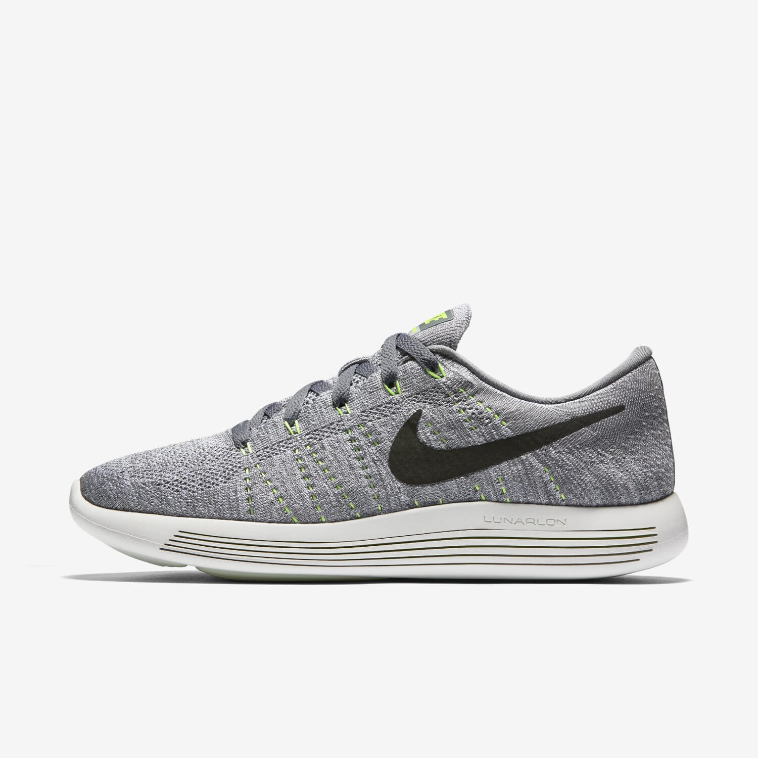
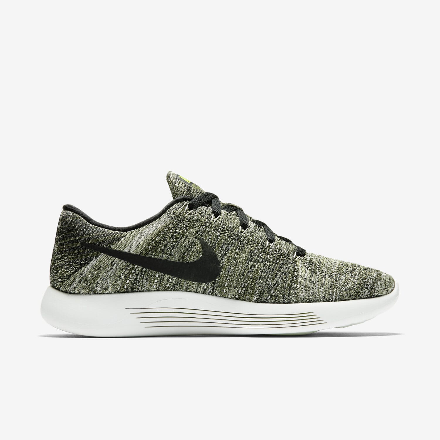
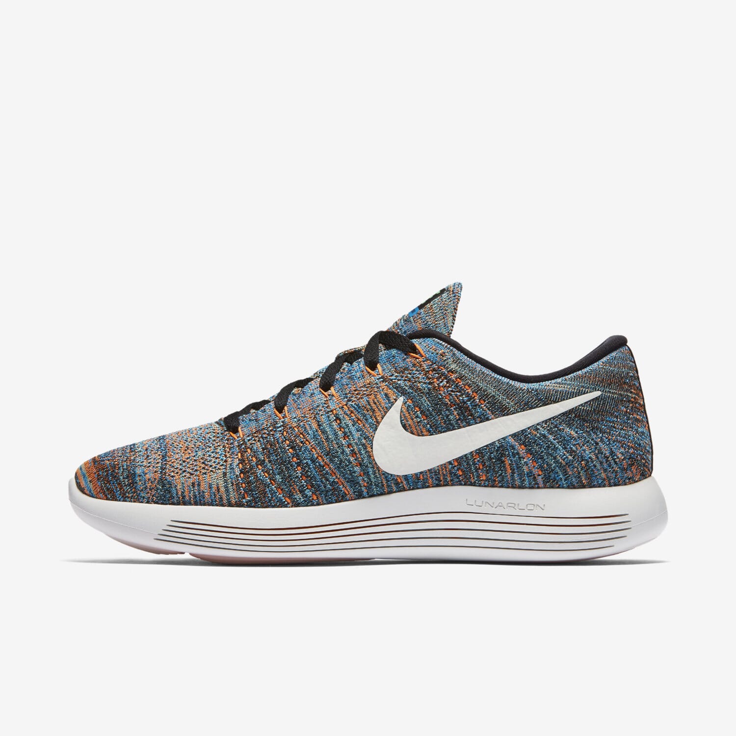
<a href="big.jpg" class="MagicThumb" data-options="captionPosition:right; captionSource:span;"><img src="small.jpg">
<span><h4><strong>BREATHABLE COMFORT, EFFORTLESS RIDE</strong></h4>
The [a href="http://store.nike.com/us/en_us/pd/lunarepic-low-flyknit-2-mens-running-shoe/pid-11232563/pgid-11558949" rel="nofollow"]Nike LunarEpic Low Flyknit Men's Running Shoe[/a] is lightweight and breathable with targeted cushioning for a soft, effortless sensation underfoot.
<h5>ULTRA-LIGHT SUPPORT</h5>
A flexible, breathable Flyknit upper wraps your foot for a second-skin fit. Targeted areas provide lightweight support where you need it most.
<h5>FLUID FEEL</h5>
The soft, contoured Lunarlon midsole has precision-lasered cuts on the sides that collapse during footstrike, delivering a perfectly smooth transition from heel to toe.
<h5>SUPERB SOFTNESS</h5>
The pressure-mapped, laser-cut outsole amplifies the cushioning exactly where you need it, and disperses the impact across the entire foot, for incredible comfort and smoothness.

<form action="https://www.magictoolbox.com/magicthumb/examples/"><input type="submit" value="More Examples"></form>
<h5>STATS</h5>
<ul>
 	<li>Weight: 9.6 ounces</li>
 	<li>Offset: 10mm</li>
</ul>
<h5>FLYKNIT ORIGINS</h5>
Nike Flyknit technology was inspired by feedback from runners seeking a shoe with the snug (and virtually unnoticed) fit of a sock. Nike embarked on a four-year mission with teams of programmers, engineers and designers to create the technology needed to make the knit upper with static properties for structure and durability. Then the precise placement of support, flexibility and breathability—all in one layer—was refined. The result is a featherweight, formfitting and virtually seamless upper.</span></a>
Text with links
You can open images from text like so: Look at this image!<a href="big.jpg" class="MagicThumb">Look at this image</a>!You can also open images via buttons, forms, menus and in other ways. Refer to the API example below.
CSS
You can change the styling of the caption, font, colors, background and borders by editing the magicthumb.css file. Either edit the content of the CSS file itself or copy the styles you wish to change, paste them into your HTML page and adjust styles. By placing your edits in your own page, you won't need to worry about overwriting your changes in magicthumb.css in future, when you upgrade to the latest version of your Magic Thumb license. For quick reference, here is the latest magicthumb.css file (link opens in new window). In the rare case that you want different styles on different images, you can create a new CSS class and reference it in data-options using cssClass parameter:<a href="big.jpg" class="MagicThumb" data-options="cssClass: yourname"><img src="small.jpg"></a>Add your style changes to the <head> of your page e.g.:
<style>
.yourname.MagicThumb {
    border: 2px solid #a01894;
}

.yourname .mgt-bg {
    background-color: #78d3dc;
}

.yourname .MagicThumb-expanded {
    border: 10px solid red;
}
</style>
<a href="big.jpg" class="MagicThumb" data-options="cssClass: yourname"><img src="small.jpg"> </a>
Buttons
Forward, back and close buttons are shown in the corner of the entire browser window by default. This setting is named auto. Instead, you can position the buttons on the image by using the buttons parameter. Choose from top-left, top-right, bottom-left, bottom-right. This demo places buttons over the bottom-right of the image:


<a href="big1.jpg" class="MagicThumb" id="buttons" data-options="buttons:bottom-right;"><img src="main1.jpg"></a>
<a href="big1.jpg" data-thumb-id="buttons" data-image="main1.jpg"><img src="tiny1.jpg"></a>
<a href="big2.jpg" data-thumb-id="buttons" data-image="main2.jpg"><img src="tiny2.jpg"></a>
<a href="big3.jpg" data-thumb-id="buttons" data-image="main3.jpg"><img src="tiny3.jpg"></a>
<a href="big4.jpg" data-thumb-id="buttons" data-image="main4.jpg"><img src="tiny4.jpg"></a>
<a href="big5.jpg" data-thumb-id="buttons" data-image="main5.jpg"><img src="tiny5.jpg"></a>
<a href="big6.jpg" data-thumb-id="buttons" data-image="main6.jpg"><img src="tiny6.jpg"></a>
Multiple images
Switch between different images of the same product by creating 3 different size of each image - a small thumbnail, a main image and a large image. In the example below, each JPEG is sufficed with tiny, main or big (though any name can be used). To swap between many image, add an id to the <a> tag, then use the data-thumb-id attribute to associate your images, for example: 
<a href="big1.jpg" class="MagicThumb" id="hello"><img src="main1.jpg"></a>
<a href="big1.jpg" data-thumb-id="hello" data-image="main1.jpg"><img src="tiny1.jpg"></a>
<a href="big2.jpg" data-thumb-id="hello" data-image="main2.jpg"><img src="tiny2.jpg"></a>
<a href="big3.jpg" data-thumb-id="hello" data-image="main3.jpg"><img src="tiny3.jpg"></a>
<a href="big4.jpg" data-thumb-id="hello" data-image="main4.jpg"><img src="tiny4.jpg"></a>
<a href="big5.jpg" data-thumb-id="hello" data-image="main5.jpg"><img src="tiny5.jpg"></a>
<a href="big6.jpg" data-thumb-id="hello" data-image="main6.jpg"><img src="tiny6.jpg"></a>
<a href="big1.jpg" class="MagicThumb" id="hello" data-options="selectorTrigger:hover;"><img src="main1.jpg"></a>
<a href="big1.jpg" data-thumb-id="hello" data-image="main1.jpg"><img src="tiny1.jpg"></a>
<a href="big2.jpg" data-thumb-id="hello" data-image="main2.jpg"><img src="tiny2.jpg"></a>
<a href="big3.jpg" data-thumb-id="hello" data-image="main3.jpg"><img src="tiny3.jpg"></a>
<a href="big4.jpg" data-thumb-id="hello" data-image="main4.jpg"><img src="tiny4.jpg"></a>
<a href="big5.jpg" data-thumb-id="hello" data-image="main5.jpg"><img src="tiny5.jpg"></a>
<a href="big6.jpg" data-thumb-id="hello" data-image="main6.jpg"><img src="tiny6.jpg"></a>
Expand thumbnails
To save time, thumbnails can expand the large image straight away, instead of swapping the main image. To apply it, set the selectorEffect attribute to expand, for example: <a href="big1.jpg" class="MagicThumb" id="hello" data-options="selectorEffect: expand"><img src="main1.jpg"></a> <a href="big1.jpg" data-thumb-id="hello" data-image="main1.jpg"><img src="tiny1.jpg"></a> <a href="big2.jpg" data-thumb-id="hello" data-image="main2.jpg"><img src="tiny2.jpg"></a> <a href="big3.jpg" data-thumb-id="hello" data-image="main3.jpg"><img src="tiny3.jpg"></a> <a href="big4.jpg" data-thumb-id="hello" data-image="main4.jpg"><img src="tiny4.jpg"></a> <a href="big5.jpg" data-thumb-id="hello" data-image="main5.jpg"><img src="tiny5.jpg"></a> <a href="big6.jpg" data-thumb-id="hello" data-image="main6.jpg"><img src="tiny6.jpg"></a>
Speed
Define how long the enlarge effect takes to open using expandSpeed. Once in the enlarged view you can choose how long it takes images to switch using gallerySpeed. The speed is calculated in milliseconds, from 0 (fast) to 10000 (slow), e.g.: 

<a href="big1.jpg" class="MagicThumb" id="hello" data-options="expandSpeed:2000; gallerySpeed:2000"><img src="main1.jpg"></a>
<a href="big1.jpg" data-thumb-id="hello" data-image="main1.jpg"><img src="tiny1.jpg"></a>
<a href="big2.jpg" data-thumb-id="hello" data-image="main2.jpg"><img src="tiny2.jpg"></a>
<a href="big3.jpg" data-thumb-id="hello" data-image="main3.jpg"><img src="tiny3.jpg"></a>
<a href="big4.jpg" data-thumb-id="hello" data-image="main4.jpg"><img src="tiny4.jpg"></a>
<a href="big5.jpg" data-thumb-id="hello" data-image="main5.jpg"><img src="tiny5.jpg"></a>
<a href="big6.jpg" data-thumb-id="hello" data-image="main6.jpg"><img src="tiny6.jpg"></a>
<a href="big7.jpg" data-thumb-id="hello" data-image="main7.jpg"><img src="tiny7.jpg"></a>
Size
If the enlarged image is taller or wider than the users' screen, it is automatically scaled down to fit the screen without scrolling. Alternatively, you can show the original full size image by setting expandImageSize to original, for example:
<a href="big.jpg" class="MagicThumb" data-options="expandImageSize:original"><img src="small.jpg"></a>
Video lightbox
Magic Thumb is an excellent way to display videos as well as images. Display videos hosted on your website or on YouTube or Vimeo URL. Example with YouTube and Vimeo:<a href="big1.jpg" class="MagicThumb" id="hello"><img src="main1.jpg"></a> <a href="big1.jpg" data-thumb-id="hello" data-image="main1.jpg"><img src="tiny1.jpg"></a> <a href="big2.jpg" data-thumb-id="hello" data-image="main2.jpg"><img src="tiny2.jpg"></a> <a href="YOUTUBE-VIDEO-URL" data-thumb-id="hello"><img src="tiny4.jpg"></a> <a href="VIMEO-VIDEO-URL" data-thumb-id="hello"><img src="tiny5.jpg"></a>
<a href="big1.jpg" class="MagicThumb" id="hello"><img src="main1.jpg"></a>
<a href="big1.jpg" data-thumb-id="hello" data-image="main1.jpg"><img src="tiny1.jpg"></a>
<a href="https://www.youtube.com/watch?v=RLiG6Dj6wmI" data-thumb-id="hello"></a>
<a href="https://vimeo.com/162826208" data-thumb-id="hello"></a>
Alternatively, you can display the video itself, which will open on click in Magic Thumb: You can customize the lightbox with any of the usual Magic Thumb parameters. This Vimeo example has been customized to always show the hint text:
Custom videos
To show videos hosted on your own website or elsewhere, Magic Thumb supports these common video formats:- mp4 - a digital multimedia container format
- ogv - a free lossy video compression format
- flv - a flash video container file format
- 3gp - a multimedia container format
- webm - an open media file format
<a href="your-video-url.mp4" class="MagicThumb"></a>The most widely used format is mp4. However, there is no single video format supported by all browsers, so it is recommended to provide a second video in a fallback format. Do this by adding the
extra-formats option and inside it, place the either video.ogv, video.flv, video.3gp or video.webm according to the fallback format you have. The code below uses mp4 as the primary format and flv as the fallback in case mp4 isn't supported:<a href="your-video-url.mp4" extra-formats="video.flv" class="MagicThumb"></a>
Group images
Images which are spread around a web page can be combined to appear in the same enlarged view. This is achieved usinggroup parameter, for example these images are all using 1 to group them together:<a href="big1.jpg" class="MagicThumb" data-options="group: 1"><img src="small1.jpg"></a> <a href="big2.jpg" class="MagicThumb" data-options="group: 1"><img src="small2.jpg"></a> <a href="big3.jpg" class="MagicThumb" data-options="group: 1"><img src="small3.jpg"></a> <a href="big4.jpg" class="MagicThumb" data-options="group: 1"><img src="small4.jpg"></a> <a href="big5.jpg" class="MagicThumb" data-options="group: 1"><img src="small5.jpg"></a> <a href="big6.jpg" class="MagicThumb" data-options="group: 1"><img src="small6.jpg"></a>But if different images relate to specific subjects, you can choose which images are shown in the enlarged view. As long as the
group name is the same, the images will be grouped together, for example:<a href="big1.jpg" class="MagicThumb" data-options="group: 1"><img src="small1.jpg"></a> <a href="big2.jpg" class="MagicThumb" data-options="group: 1"><img src="small2.jpg"></a> <a href="big3.jpg" class="MagicThumb" data-options="group: 2"><img src="small3.jpg"></a> <a href="big4.jpg" class="MagicThumb" data-options="group: 2"><img src="small4.jpg"></a> <a href="big5.jpg" class="MagicThumb" data-options="group: 3"><img src="small5.jpg"></a> <a href="big6.jpg" class="MagicThumb" data-options="group: 3"><img src="small6.jpg"></a>
Enlarge your slideshow
You can add enlarge effects to each image in a slideshow by combining Magic Thumb with Magic Slideshow. Update your file references before your </head> tag. For example:
<script src="magicthumb/magicthumb.js"></script>
<script src="magicslideshow/magicslideshow.js"></script>
<style>.mss-slide div { text-align:center; }</style>
Place the following code in the <body> tag of your web page and your slideshow will look like this. The example below uses thumbnails: <div class="MagicSlideshow" data-options="autoplay: false; selectors: bottom; selectors-style: thumbnails;" id="thumb-slideshow"> <a href="big1.jpg" class="MagicThumb" data-options="group:slideshow-thumbnails;" data-thumb-image="tiny1.jpg"><img src="small1.jpg"></a> <a href="big2.jpg" class="MagicThumb" data-options="group:slideshow-thumbnails;" data-thumb-image="tiny2.jpg"><img src="small2.jpg"></a> <a href="big3.jpg" class="MagicThumb" data-options="group:slideshow-thumbnails;" data-thumb-image="tiny3.jpg"><img src="small3.jpg"></a> <a href="big4.jpg" class="MagicThumb" data-options="group:slideshow-thumbnails;" data-thumb-image="tiny4.jpg"><img src="small4.jpg"></a> </div>
If you prefer to use bullets instead of thumbnails, please use this code in your <body> tag:
<div class="MagicSlideshow" data-options="autoplay: false; selectors: bottom; selectors-style: bullets;" id="bullet-slideshow">
<a href="big1.jpg" class="MagicThumb" data-options="group:slideshow-bullets;"><img src="small1.jpg"></a>
<a href="big2.jpg" class="MagicThumb" data-options="group:slideshow-bullets;"><img src="small2.jpg"></a>
<a href="big3.jpg" class="MagicThumb" data-options="group:slideshow-bullets;"><img src="small3.jpg"></a>
<a href="big4.jpg" class="MagicThumb" data-options="group:slideshow-bullets;"><img src="small4.jpg"></a>
</div>
Hint
A text hint "Click to expand" is displayed on the image to indicate that it is zoomable. On mobiles, the text is "tap to expand". The hint appears on load, then hides once the user first interacts with the image. You can configure the hint to always appear on the image by setting thehint option to always. To remove the hint, set the hint parameter to off. Click the toggle to test the three options:<a href="big.jpg" class="MagicThumb" data-options="hint: once"><img src="small.jpg"></a>
textHint option. This is useful to change the language or if the enlarge effect has been changed to activate on hover instead of on click. For example:<a href="big.jpg" class="MagicThumb" data-options="expandTrigger:hover; hint: always; textHint: Hover to enlarge"><img src="small.jpg"></a>
Lazy load
For the fastest user experience, Magic Thumb preloads the large image during page load so that it is instantly ready to view if the user clicks to enlarge it. Instead, you can configure the large image to load on demand (lazy-loading) with thelazyLoad: true option. The large image will be downloaded when the user clicks to expand it. The lazy loading code looks like this:<a href="big.jpg" class="MagicThumb" data-options="lazyLoad: true"><img src="small.jpg"></a>
Autostart
Magic Thumb starts automatically during page load. Alternatively, you can start it manually by setting theautostart parameter to false, like so:<a href="big.jpg" class="MagicThumb" data-options="autostart: false"><img src="small.jpg"></a>
API & callbacks
API methods
Control Magic Thumb exactly how you want with these 14 JavaScript calls:- MagicThumb.start(); - enable all Magic Thumb images on the page.
- MagicThumb.start('id'); - enable a particular image by calling its id (in the <a> tag).
- MagicThumb.stop(); - stop all images on the page.
- MagicThumb.stop('id'); - stop a particular image by calling its id (in the <a> tag).
- MagicThumb.refresh(); - reload all Magic Thumb images on the page.
- MagicThumb.refresh('id'); - reload a particular image by calling its id (in the <a> tag).
- MagicThumb.expand('id'); - expand a particular image by calling its id (in the <a> tag).
- MagicThumb.close('id'); - restore a particular image by calling its id (in the <a> tag).
- MagicThumb.next('id'); - switch to next image by calling its id (in the <a> tag).
- MagicThumb.prev('id'); - switch to previous image by calling its id (in the <a> tag).
- MagicThumb.switchTo('id', selector); - Switch to a particular image by calling its id and selector. selector refers to either the selectors DOM element or its index number (index number starts from 0).
- MagicThumb.isReady('id'); - returns true if Magic Thumb can use API methods by calling its id (in the <a> tag).
- MagicThumb.isLoad('id'); - returns true if Magic Thumb loaded images by calling its id (in the <a> tag).
- MagicThumb.update(node, large-image-url, small-image-url); - update particular Magic Thumb by calling its id (in the <a> tag).
<script>
MagicThumb.expand('id-of-your-choice');
</script>

<a href="big.jpg" class="MagicThumb" id="id-of-your-choice"><img src="small.jpg"></a>
Or:<script>
MagicThumb.expand(document.getElementById('id-of-your-choice'));
</script>
<a href="big.jpg" class="MagicThumb" id="id-of-your-choice"><img src="small.jpg"></a>
Callbacks
- onReady: function({ group: "thumb_id" }) {} - triggers when a Magic Thumb instance with a particular id (in its <a> tag) is ready to operate.
- onLoad: function({ group: "thumb_id" }) {} - triggers when a Magic Thumb instance with a particular id (in its <a> tag) is ready to operate and images have downloaded.
- onSwap: function({ group: "thumb_id" }) {} - triggers when images are swapped in a Magic Thumb instance with a particular id (in its <a> tag).
- onExpandSwap: function({ group: "thumb_id" }) {} - triggers when a images are swapped in the expanded view of a Magic Thumb instance with a particular id (in its <a> tag).
- onUpdate: function({ group: "thumb_id" }) {} - triggers when images are changed in a Magic Thumb instance with a particular id (in its <a> tag).
- onExpand: function({ group: "thumb_id", itemId: "id_of_selector" }) {} - triggers when an image is expanded in a Magic Thumb instance with a particular id (in its <a> tag).
- onClose: function({ group: "thumb_id", itemId: "id_of_selector" }) {} - triggers when an expanded image is closed in a Magic Thumb instance with a particular id (in its <a> tag).
Keyboard navigation
Magic Thumb can be controlled with these key strokes:- Left arrow - previous image
- Right arrow - next image
- Escape - close
<a href="big.jpg" class="MagicThumb" data-options="keyboard:false;"><img src="small.jpg"></a>
Parameters
Below is the complete list Magic Thumb parameters. You can apply parameters via thedata-options attribute, with multiple parameters separated by a semi-colon, for example:<a href="big.jpg" class="MagicThumb" data-options="expandSpeed:1500; expandEffect:fade"><img src="small.jpg"></a>Alternatively, you may also apply parameters via the
MagicThumbOptions variable, for example:<script>
var MagicThumbOptions = {
expandSpeed:'1500',
expandEffect:'fade'
};
</script>
| Parameter | Default | Options | Description |
|---|---|---|---|
| Effect | |||
| expandSpeed | 350 | 0-10000 (milliseconds) | Duration when enlarging image. |
| expandEffect | expand | expand / fade | Effect while expanding image. |
| expandEasing | cubic-bezier(.12,1.32,.57,1.54) | string | CSS3 Animation Easing. See cubic-bezier.com. |
| expandTrigger | click | click / hover | How to trigger enlarge effect. |
| selectorEffect | switch | switch / expand | Effect to use when switching between thumbnail images. |
| selectorTrigger | click | click / hover | Method to switch between thumbnail images. |
| gallerySpeed | 250 | 0-10000 (milliseconds) | Speed images take to switch in enlarge view. |
| Positioning | |||
| expandImageSize | fit-screen | fit-screen / original | Size of expanded view. |
| expandAlign | screen | screen / image | Align expanded image relative to screen or small image. |
| Caption | |||
| captionSource | title | title / alt / span | Source of caption text. |
| captionPosition | bottom | bottom / right / off | Where to position caption. |
| Buttons | |||
| buttons | auto | auto / top-left / top-right / bottom-left / bottom-right / off | Where to position buttons. |
| textBtnClose | Close | string | Text label that appears on mouse over the "close" button. |
| textBtnNext | Next | string | Text label that appears on mouse over the "next" button arrow. |
| textBtnPrev | Previous | string | Text label that appears on mouse over the "previous" button arrow. |
| Miscellaneous | |||
| loop | true | true / false | Rewind to the first item after the last or stop at the last item. |
| textClickHint | Click to expand | string | Hint that shows when thumb mode activated, or in inactive state if thumb mode is disabled. |
| textHoverHint | Hover to expand | string | Hint that shows when thumb mode activated, or in inactive state if thumb mode is disabled (when expandTrigger is set to hover). |
| hint | once | once / always / off | How to show hint. |
| keyboard | true | true / false | Ability to use keyboard shortcuts. |
| rightClick | true | true / false | Whether to allow context menu on right click. |
| group | string | Group images into gallery. | |
| cssClass | string | Extra CSS class applied to lightbox. | |
| link | string | Link enlarged image to a URL. | |
| linkTarget | _self | _self / _blank | Open link in browser window/frame. |
| lazyLoad | false | true / false | Whether to load large image on demand. |
| autostart | true | true / false | Whether to start Magic Thumb on image automatically on page load or manually. |
Mobile options
For mobile devices (smartphones in particular), global parameters can be overwritten either with the MagicThumbMobileOptions variable:
<script>
var MagicThumbMobileOptions = {
  expandEffect:'fade'
};
</script>
or locally via the data-mobile-options attribute:<a href="big.jpg" class="MagicThumb" data-mobile-options="expandEffect: fade;"><img src="small.jpg"></a>
| Parameter | Default | Options | Description |
|---|---|---|---|
| textClickHint | Tap to expand | string | Hint that shows when thumb mode activated, or in inactive state if thumb mode is disabled. |
| slideMobileEffect | rotate | rotate / straight | Effect images use to switch in enlarge view for mobile devices. |