Enable zoom on your images. It's fast, and it's easy.
Getting Started
If you use one of these platforms, click your platform and follow the instructions:
No platform in the list above, install Magic Zoom like so:
- Download the Magic Zoom demo.
- Unzip the file on your computer and FTP the
magiczoomfolder to your website directory (on your server), keeping the file and folder structure intact. - Reference
magiczoom.cssandmagiczoom.jsfiles before the</head>of your page:<link rel="stylesheet" href="magiczoom/magiczoom.css"> <script src="magiczoom/magiczoom.js"></script>
(If you cannot access the
headsection of your page, reference the files elsewhere such as the main content of your page.) Create a zoom by linking your small image to your big image with a CSS class of
MagicZoom:<a href="big-image.jpg" class="MagicZoom"><img src="small-image.jpg"></a>
- Now it's working. Use the settings wizard to create your perfect Zoom. If you get stuck, email us.
To remove the Magic Zoom™ trial version message, buy a license and upload your licensed magiczoom.js file. Or, apply for a free license if your site is non-commercial.
Below, we explain all the Magic Zoom options and how to adjust them, starting with Size...
Zoom Size
The zoom window is set at the same dimensions as the small image by default.
<a href="big.jpg" class="MagicZoom"><img src="small.jpg"></a>
Change the size of the zoomed area with the zoomWidth and/or zoomHeight parameters. Here is a larger zoom window. Notice that the location of the zoom window automatically changes if there is insufficient space on the users screen.
<a href="big.jpg" class="MagicZoom" data-options="zoomWidth:400px; zoomHeight:400px"><img src="small.jpg"></a>
Define the size of the zoom window as a percentage of the small image. Here is a half-width zoom:
<a href="big.jpg" class="MagicZoom" data-options="zoomWidth:50%"><img src="small.jpg"></a>
Zoom Position
Adjust the location of the zoomed image with zoomPosition. Try these examples for right, bottom, left, top (note that the position automatically moves to another position if there is insufficient screen space):
<a href="big.jpg" class="MagicZoom" data-options="zoomPosition: top"><img src="small.jpg"></a>
Internal Zoom
Zoom inside the image by setting the zoomPosition to inner. Example:
<a href="big.jpg" class="MagicZoom" data-options="zoomPosition: inner"><img src="small.jpg"></a>
Placeholder
You can position the zoomed image literally anywhere on your page if you create a placeholder (e.g. <div id="zoom-placeholder">) and reference it with an unique #id in the zoomPosition parameter.
<a href="large.jpg" class="MagicZoom" data-options="zoomPosition: #zoom-placeholder;"><img src="small.jpg"></a>

<style>
  #zoom-placeholder {
    position: fixed;
    bottom: 50px;
    right: 10px;
    z-index: 100;
    width: 250px;
    height: 250px;
  }
</style>
<div id="zoom-placeholder"></div>
Distance
Change the distance from the main image to the zoom (default is 15px) with the zoomDistance parameter. Example:
<a href="big.jpg" class="MagicZoom" data-options="zoomDistance: 200"><img src="small.jpg"></a>
Zoom Mode
Magic Zoom has a choice of zoom techniques: Zoom, Magnifier and Preview.
Zoom
Zoom on hover is the default mode:
<a href="big.jpg" class="MagicZoom"><img src="small.jpg"></a>
Magnifier
An elegant magnifying glass can be chosen with zoomMode set to magnifier. The default size is 70% of the small image. To show magnifier as a square, add mz-square to the cssClass option:
<a href="big.jpg" class="MagicZoom" data-options="zoomMode: magnifier"><img src="small.jpg"></a>
Permit users to control the magnifier with their mousewheel - set variableZoom to true.
<a href="big.jpg" class="MagicZoom" data-options="zoomMode: magnifier; variableZoom: true"><img src="small.jpg"></a>
Preview
For quick previews, show an entire image on hover. This is excellent for immediately showing larger images on category pages or search result listings.
<a href="large.jpg" class="MagicZoom" data-options="zoomMode: preview"><img src="small.jpg"></a>
To turn off zoom effect on image, set the zoomMode parameter to off:
<a href="large.jpg" class="MagicZoom" data-options="zoomMode: false"><img src="small.jpg"></a>
Image Gallery
You can display different images of a product by adding an id attribute to the main image link and a data-zoom-id attribute to the alternative image links.
Use href attribute in the alternative image link to specify an URL to the big image and data-image for the path to the small image.
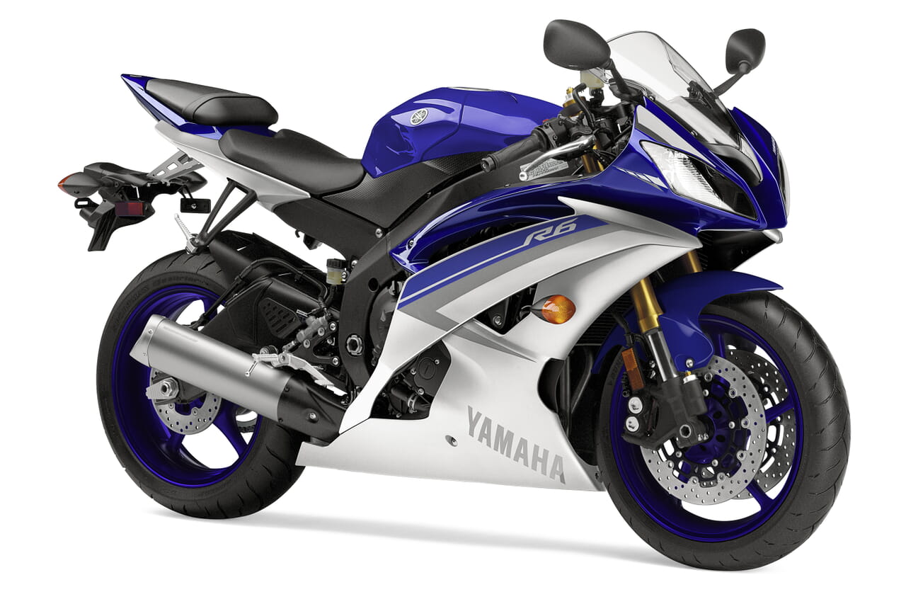
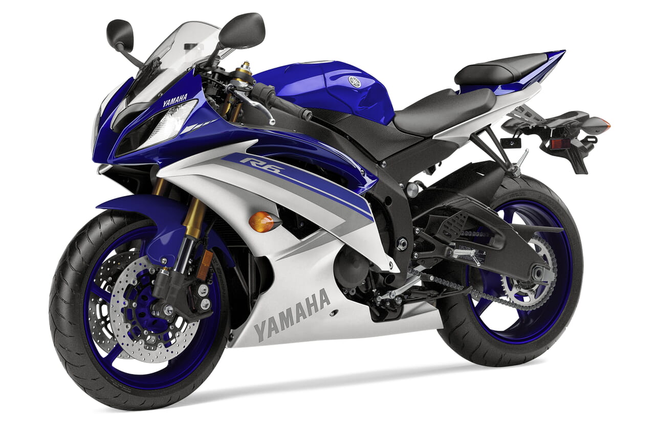
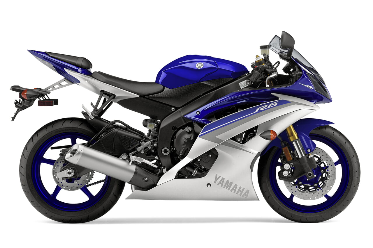
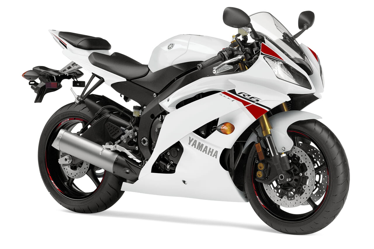
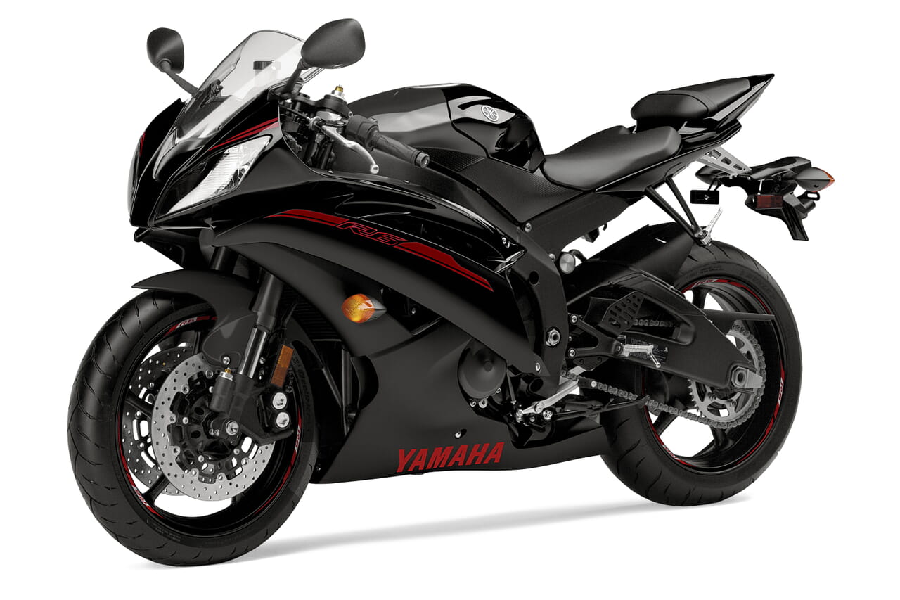
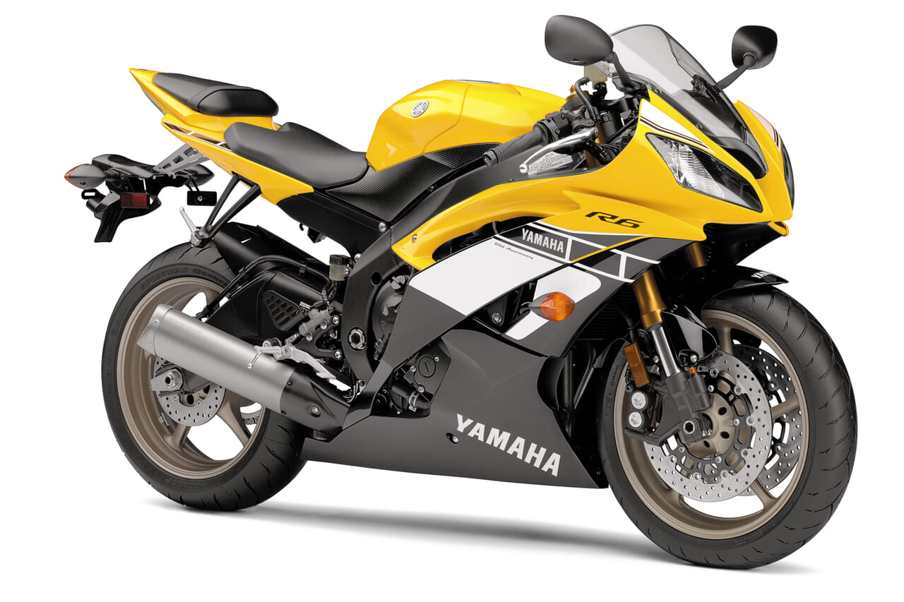
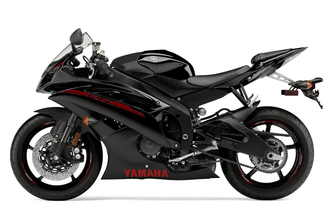
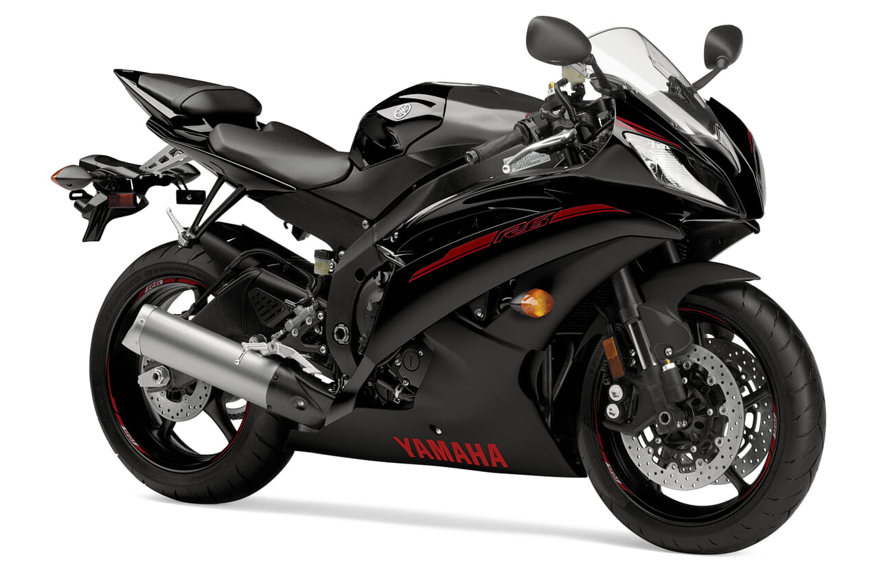
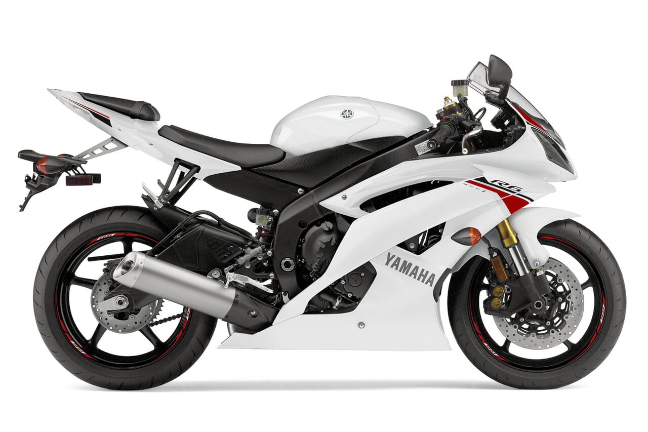
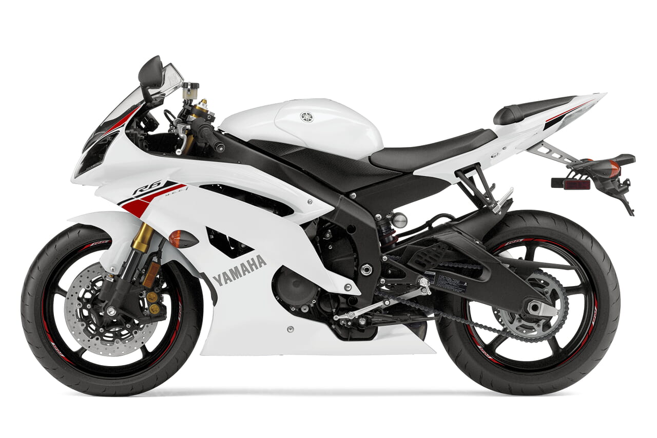
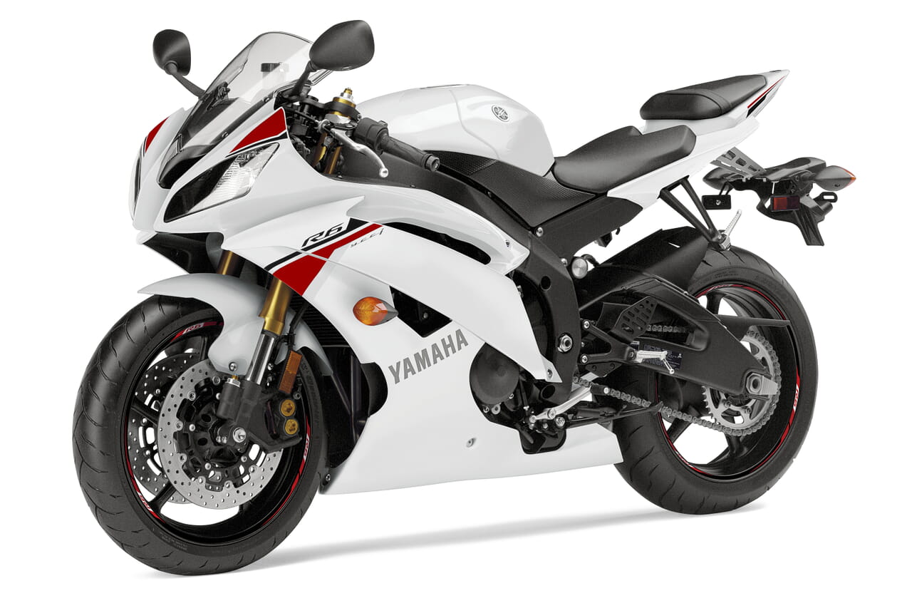
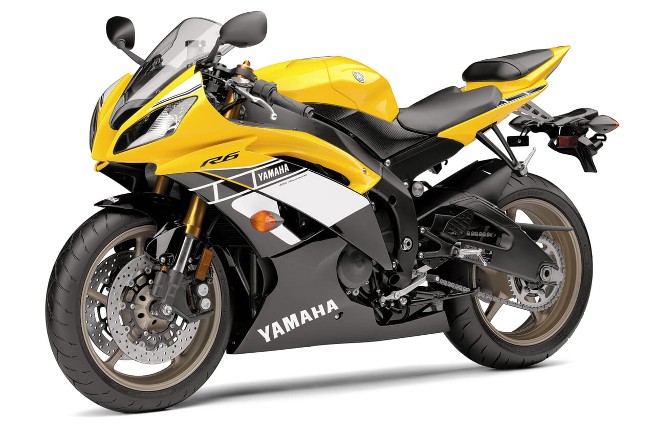
In the example below, the unique id is motorbike. There are 3 images - big, small and tiny.
<a href="motorbike1-big.jpg" class="MagicZoom" id="motorbike"><img src="motorbike1-small.jpg"></a>

<a data-zoom-id="motorbike" href="motorbike1-big.jpg" data-image="motorbike1-small.jpg"><img src="motorbike1-tiny.jpg"></a>
<a data-zoom-id="motorbike" href="motorbike2-big.jpg" data-image="motorbike2-small.jpg"><img src="motorbike2-tiny.jpg"></a>
<a data-zoom-id="motorbike" href="motorbike3-big.jpg" data-image="motorbike3-small.jpg"><img src="motorbike3-tiny.jpg"></a>
<a data-zoom-id="motorbike" href="motorbike4-big.jpg" data-image="motorbike4-small.jpg"><img src="motorbike4-tiny.jpg"></a>
TIP: If activated, lazyZoom will apply to both big and small sized images (not tiny images).
Images swap by default when clicked with a dissolve transition. To swap the images on mouse over, set selectorTrigger to hover. You can also turn off the dissolve effect with the transitionEffect: false:
<a href="motorbike1-big.jpg" class="MagicZoom" id="motorbike" data-options="selectorTrigger: hover; transitionEffect: false"><img src="motorbike1-small.jpg"></a>

<a data-zoom-id="motorbike" href="motorbike1-big.jpg" data-image="motorbike1-small.jpg"><img src="motorbike1-tiny.jpg"></a>
<a data-zoom-id="motorbike" href="motorbike2-big.jpg" data-image="motorbike2-small.jpg"><img src="motorbike2-tiny.jpg"></a>
<a data-zoom-id="motorbike" href="motorbike3-big.jpg" data-image="motorbike3-small.jpg"><img src="motorbike3-tiny.jpg"></a>
<a data-zoom-id="motorbike" href="motorbike4-big.jpg" data-image="motorbike4-small.jpg"><img src="motorbike4-tiny.jpg"></a>
Gallery arrows
Add arrows to your image gallery to inspire visitors to browse previous and next images. Set cssClass parameter tomz-show-arrows and the left and right arrows will display neatly next to your main image:
<a href="motorbike1-big.jpg" class="MagicZoom" id="motorbike" data-options="cssClass: mz-show-arrows;"><img src="motorbike1-small.jpg"></a>

<a data-zoom-id="motorbike" href="motorbike1-big.jpg" data-image="motorbike1-small.jpg"><img src="motorbike1-tiny.jpg"></a>
<a data-zoom-id="motorbike" href="motorbike2-big.jpg" data-image="motorbike2-small.jpg"><img src="motorbike2-tiny.jpg"></a>
<a data-zoom-id="motorbike" href="motorbike3-big.jpg" data-image="motorbike3-small.jpg"><img src="motorbike3-tiny.jpg"></a>
<a data-zoom-id="motorbike" href="motorbike4-big.jpg" data-image="motorbike4-small.jpg"><img src="motorbike4-tiny.jpg"></a>
Gallery thumbnails
To highlight each gallery thumbnail completely when selected, set cssClass parameter tothumbnails-style-shaded:
<a href="motorbike1-big.jpg" class="MagicZoom" id="motorbike" data-options="cssClass: thumbnails-style-shaded;"><img src="motorbike1-small.jpg"></a>

<a data-zoom-id="motorbike" href="motorbike1-big.jpg" data-image="motorbike1-small.jpg"><img src="motorbike1-tiny.jpg"></a>
<a data-zoom-id="motorbike" href="motorbike2-big.jpg" data-image="motorbike2-small.jpg"><img src="motorbike2-tiny.jpg"></a>
<a data-zoom-id="motorbike" href="motorbike3-big.jpg" data-image="motorbike3-small.jpg"><img src="motorbike3-tiny.jpg"></a>
<a data-zoom-id="motorbike" href="motorbike4-big.jpg" data-image="motorbike4-small.jpg"><img src="motorbike4-tiny.jpg"></a>
Tip: Add a space between each cssClass option when using multiple settings. For example, if you would like to show gallery arrows (mz-show-arrows) and shade thumbnail completely (thumbnails-style-shaded), your code will look like this:
<a href="motorbike1-big.jpg" class="MagicZoom" id="motorbike" data-options="cssClass: mz-show-arrows thumbnails-style-shaded;"><img src="motorbike1-small.jpg"></a>

<a data-zoom-id="motorbike" href="motorbike1-big.jpg" data-image="motorbike1-small.jpg"><img src="motorbike1-tiny.jpg"></a>
<a data-zoom-id="motorbike" href="motorbike2-big.jpg" data-image="motorbike2-small.jpg"><img src="motorbike2-tiny.jpg"></a>
<a data-zoom-id="motorbike" href="motorbike3-big.jpg" data-image="motorbike3-small.jpg"><img src="motorbike3-tiny.jpg"></a>
<a data-zoom-id="motorbike" href="motorbike4-big.jpg" data-image="motorbike4-small.jpg"><img src="motorbike4-tiny.jpg"></a>
Hint
A hint is displayed on the image to indicate that the image is zoomable and can be controlled with the hint parameter.
By default the hint appears once and hides after the first interaction with the image. You can configure hint to always appear on the image with hint: always. To remove hint, set hint parameter to off:
<a class="MagicZoom" href="big.jpg" data-options="hint: once"><img src="small.jpg"></a>
The text of the hint can be changed with the textHoverZoomHint option if zoom activates on hover or textClickZoomHint if zoom activates on click:
<a class="MagicZoom" href="big.jpg" data-options="hint: always; textHoverZoomHint: Roll over image to zoom in; textClickZoomHint: Click image to zoom in"><img src="small.jpg"></a>
Caption
Add a caption to the zoomed image by using the title attribute in the <a> tag, e.g.:
<a class="MagicZoom" title="This is a dummy caption" href="big.jpg"><img src="small.jpg"></a>
The caption is turned off by default. To show the caption, set zoomCaption parameter to the top or bottom position:
<a class="MagicZoom" data-options="zoomCaption: top" href="big.jpg"><img src="small.jpg"></a>
Click to Zoom
If you do not want the image to zoom immediately on hover, set Magic Zoom to activate zoom on click:
<a class="MagicZoom" data-options="zoomOn: click" href="big.jpg"><img src="small.jpg"></a>
This setting will also deactivate the zoomed image on click.
Lazy Zoom
For the best user experience Magic Zoom automatically preloads the large image. However, you can set lazyZoom option to true to load the large image on demand (lazy-loading) when the user triggers zoom on hover or click:
<a class="MagicZoom" data-options="lazyZoom: true" href="big.jpg"><img src="small.jpg"></a>
If displaying images in a gallery layout, lazyZoom applies to both big and small sized images (not tiny images).
Autostart
Magic Zoom starts automatically when page is loaded. To start it manually set autostart parameter to false:
<a class="MagicZoom" data-options="autostart: false" href="big.jpg"><img src="small.jpg"></a>
Retina Images
Supply @2x images for High DPI (Retina) displays. Use data-zoom-image-2x attribute in the <a class="MagicZoom"> for the large HD image and data-image-2x for the small high-resolution image:
<a class="MagicZoom" href="big.jpg" data-zoom-image-2x="big@2x.jpg" data-image-2x="small@2x.jpg">
    <img src="small.jpg">
</a>
Styling
Control the look and feel of your images by using CSS.
Zoom Window
Use the following CSS classes in your stylesheets to customize zoom window shape; border; background + more:
.mz-zoom-window {
  /* Applies to zoom window in the default zoom mode */
}

.mz-zoom-window.mz-magnifier {
  /* Applies to zoom window in the magnifier mode */
}

.mz-zoom-window.mz-preview {
  /* Applies to zoom window in the preview mode */
}

.mz-zoom-window.mz-inner {
  /* Applies to the internal zoom window */
}
Lens
Alter the look of the lens over the image in the zoom mode with .mz-lens class:
.mz-lens {
  /* Applies to the lens over the image */
}
Caption
Control the styles of the caption in a zoom window with these CSS:
.mz-zoom-window .mz-caption {
  /* Applies to the caption in zoom window */

  /* Change the background; color; font-size + more. */
}
Gallery
Customize look & feel of the thumbnails in a gallery using the CSS below:
.mz-thumb {
  /* Applies to every thumbnail */
}

.mz-thumb-selected {
  /* Applies to the active thumbnail */
}
You can either add the style to one of your external CSS files or you can place it directly into the HTML of your page.
If placing the style in your HTML page, use <style> tags, for example:
<style>
.mz-thumb {
  border: 1px;
}
.mz-thumb-selected {
  filter: brightness(100%);
}
</style>
The style can go anywhere in your HTML page after the magiczoom.css file.
API & Callbacks
API Methods
Use the Magic Zoom API commands to control your images dynamically:
MagicZoom.start(node)- Start Magic Zoom instance by#idor reference to<a>tag. Without parameters, start all instances on the page.MagicZoom.stop(node)- Stop Magic Zoom instance by#idor reference to<a>tag. Without parameters, stop all instances on the page.MagicZoom.refresh(node>)- Reload Magic Zoom instance by#idor reference to<a>. Without parameters, reload all instances on the page.MagicZoom.update(node, large-image-url, small-image-url)- Update particular zoom by #id.MagicZoom.prev(node)- Go to the previous image of a particular zoom.MagicZoom.next(node>)- Go to the next image of a particular zoom.MagicZoom.switchTo(node, selector)- Switch to a particular image by selector.selector- is either reference to selector's DOM element or index number of the selector (index number starts from 0).MagicZoom.zoomIn(node)- Activate zoom mode on a particular zoom.MagicZoom.zoomOut(node)- Deactivate zoom mode on a particular zoom.
There are all sorts of uses. Here are a few:
Callbacks
onZoomReady: function(zoom_id){ }- Fires when zoom instance is ready to operate.onUpdate: function(zoom_id, previous_image_selector, new_image_selector){ }- Fires when images swapped.onZoomIn: function(zoom_id){ }- Fires when zoom mode activated.onZoomOut: function(zoom_id){ }- Fires when zoom mode deactivated.
Example of usage:
<script>
    var mzOptions = {};
    mzOptions = {
        onZoomReady: function() {
            console.log('onReady', arguments[0]);
        },
        onUpdate: function() {
            console.log('onUpdated', arguments[0], arguments[1], arguments[2]);
        },
        onZoomIn: function() {
            console.log('onZoomIn', arguments[0]);
        },
        onZoomOut: function() {
            console.log('onZoomOut', arguments[0]);
        }
    };
</script>
Parameters
Configure Magic Zoom how you want with the parameters listed below. Each parameter can be applied via the data-options attribute. To apply multiple parameters, separate them with a semi-colon, for example:
<a href="large.jpg" class="MagicZoom" data-options="zoomMode: magnifier; zoomOn: click;"><img src="small.jpg"></a>
Or parameters may be defined globally with the mzOptions variable, e.g.:
<script>
var mzOptions = {
    zoomWidth: '400',
    zoomHeight: '250'
};
</script>
Settings for mobile
Mobile devices (tablets and smartphones) can have different settings. The mzMobileOptions variable can be used to choose options for all the zooms on a page:
<script>
var mzMobileOptions = {
  zoomMode: 'magnifier'
};
</script>
Or you can apply paramaters to a particular zoom by using the data-mobile-options attribute to the link:
<a class="MagicZoom" data-mobile-options="zoomMode: magnifier;">
| Parameter | Default | Options | Description |
|---|---|---|---|
| zoomMode | zoom | zoom | magnifier | preview | off | How to zoom image |
| zoomOn | hover | hover | click | When activate zoom |
| zoomPosition | right | left | right | top | bottom | inner | Position of zoom window |
| zoomWidth | auto | <percentage> | <pixels> | auto | Width of zoom window |
| zoomHeight | auto | <percentage> | <pixels> | auto | Height of zoom window |
| zoomDistance | 15 | <pixels> | Distance from small image to zoom window |
| zoomCaption | off | top | bottom | off | Position of caption on zoomed image |
| hint | once | once | always | off | How to show hint |
| variableZoom | false | true | false | Whether to allow changing zoom ratio with mouse wheel |
| smoothing | true | true | false | Enable/disable smooth zoom movement |
| lazyZoom | false | true | false | Whether to load large image on demand (on first activation) |
| rightClick | false | true | false | Whether to allow context menu on right click |
| upscale | true | true | false | Whether to scale up the large image if its original size is not enough for a zoom effect |
| selectorTrigger | click | click | hover | Mouse event used to swtich between multiple images |
| transitionEffect | true | true | false | Whether to enable dissolve effect when switching between images |
| autostart | true | true | false | Whether to start Zoom on image automatically on page load or manually |
| cssClass | string | Extra CSS class(es) to apply to zoom instance | |
| textHoverZoomHint | Hover to zoom | string | Hint that shows when zoom mode is enabled, but inactive. Zoom activates on hover (zoomOn: hover) |
| textClickZoomHint | Click to zoom | string | Hint that shows when zoom mode is enabled, but inactive. Zoom activates on click (zoomOn: click) |
Defaults for mobile
| Parameter | Default | Options | Description |
|---|---|---|---|
| zoomMode | zoom | zoom | magnifier | off | How to zoom image |
| textHoverZoomHint | Touch to zoom | string | Hint that shows when zoom mode is enabled, but inactive. Zoom activates on hover (zoomOn: hover) |
| textClickZoomHint | Double tap to zoom | string | Hint that shows when zoom mode is enabled, but inactive. Zoom activates on click (zoomOn: click) |