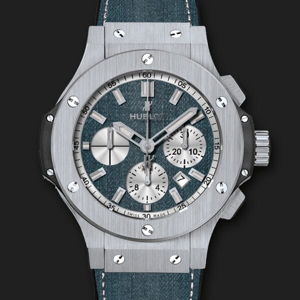
It's easy to zoom images on your site
Getting started
If you use one of these platforms, click your platform and follow the instructions: If you're not using one of the platforms above, install Magic Zoom Plus like so:- Download Magic Zoom Plus trial.
- Unzip the file on your computer and FTP the
magiczoomplusfolder to your website directory (on your server), keeping the file and folder structure intact. - Reference
magiczoomplus.jsandmagiczoomplus.cssfiles before the</head>of your page:<link rel="stylesheet" href="magiczoomplus/magiczoomplus.css"> <script src="magiczoomplus/magiczoomplus.js"></script>
If you cannot access the
headsection of your page, reference the files elsewhere such as the main content of your page. - Link your small image to your large image with a class of
MagicZoom:<a href="large-image.jpg" class="MagicZoom"><img src="small-image.jpg"></a>
- You've done it! Get inspiration from these examples or use the wizard to choose your perfect settings.
magiczoomplus.js file with your licensed version. Now let's look at how to customize Magic Zoom Plus...Zoom size
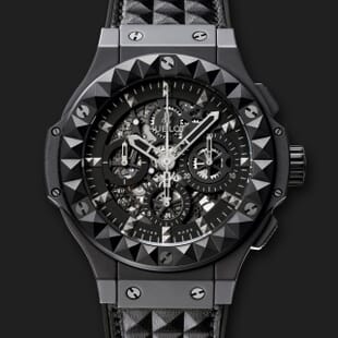
The zoomed area is automatically set at the same dimensions as the small image, for example: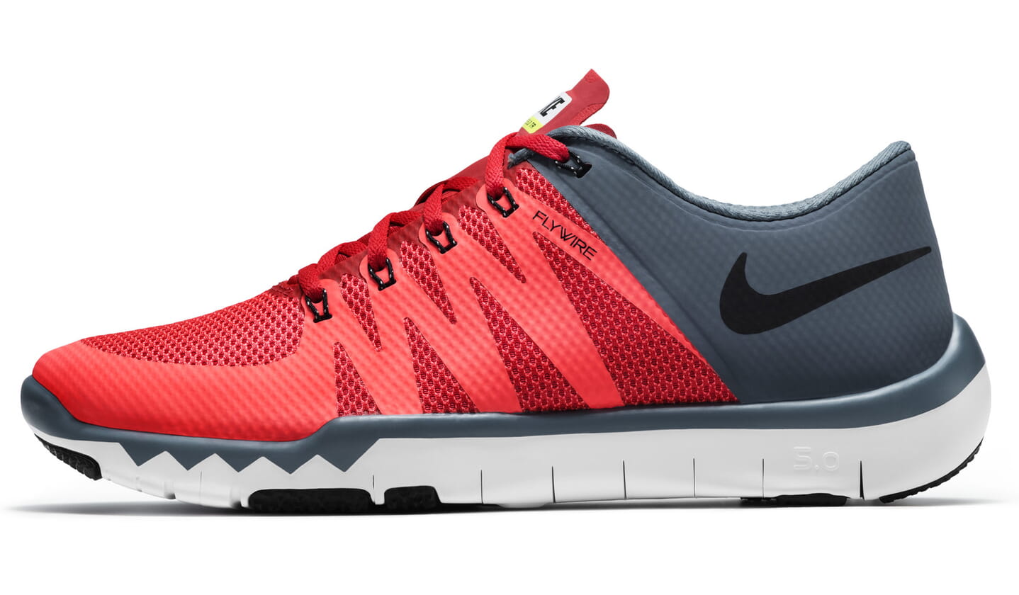
<a href="large.jpg" class="MagicZoom"><img src="small.jpg"></a>
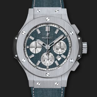
zoomWidth and/or zoomHeight parameters. Notice that the location of the zoom window automatically changes if there is insufficient space on the users screen. Here is a larger zoom window: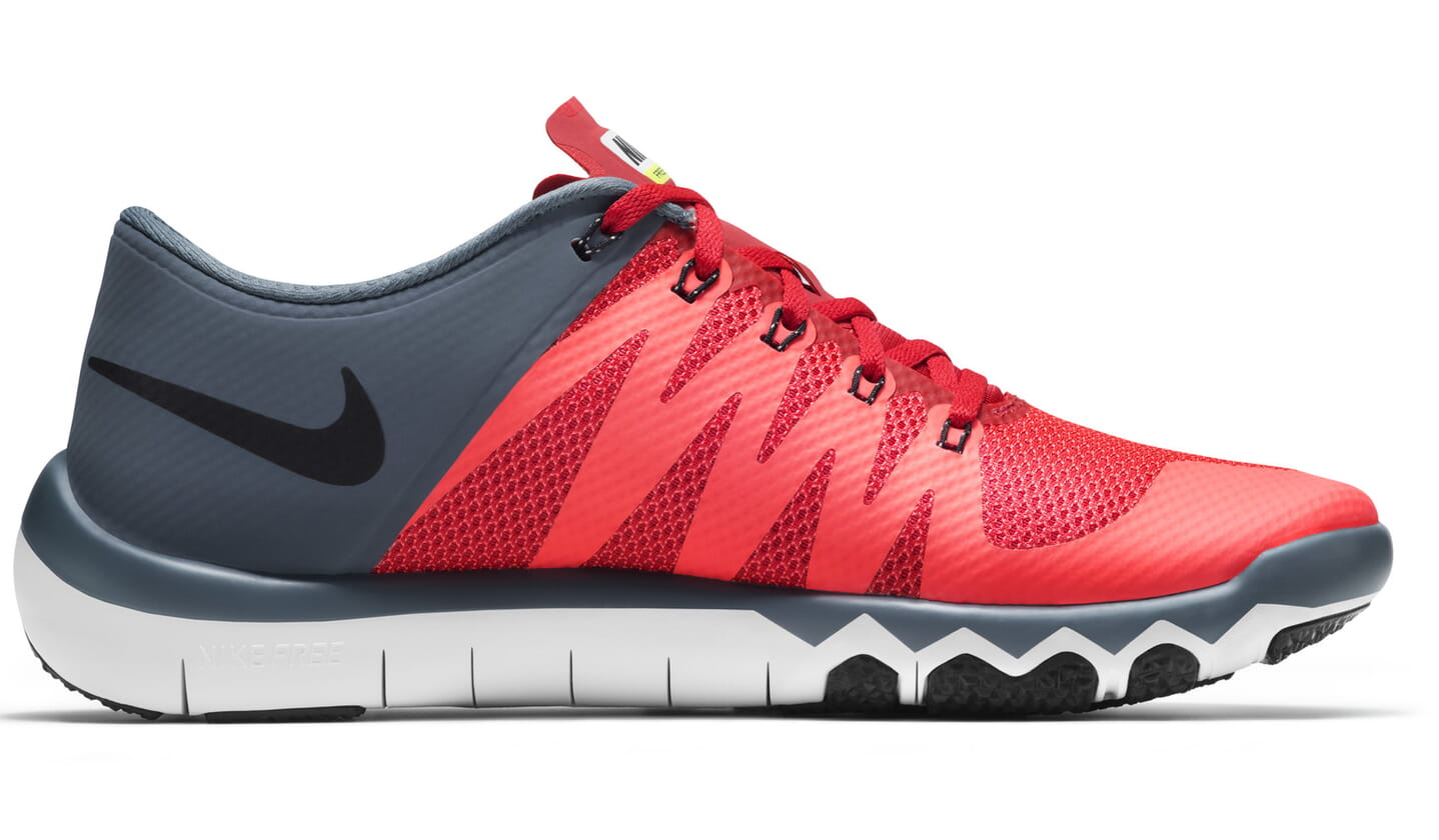
<a href="large.jpg" class="MagicZoom" data-options="zoomWidth:400px; zoomHeight:400px"><img src="small.jpg"></a>
<a href="large.jpg" class="MagicZoom" data-options="zoomWidth:70%; zoomHeight:100%"><img src="small.jpg"></a>
Zoom position
Define the location of the zoom window withzoomPosition setting. Try these examples for right, bottom, left, top (note that the position automatically changes to opposite side or to internal zoom if there is insufficient screen space):


<a href="large.jpg" class="MagicZoom" data-options="zoomPosition: top; expand: off;"><img src="small.jpg"></a>
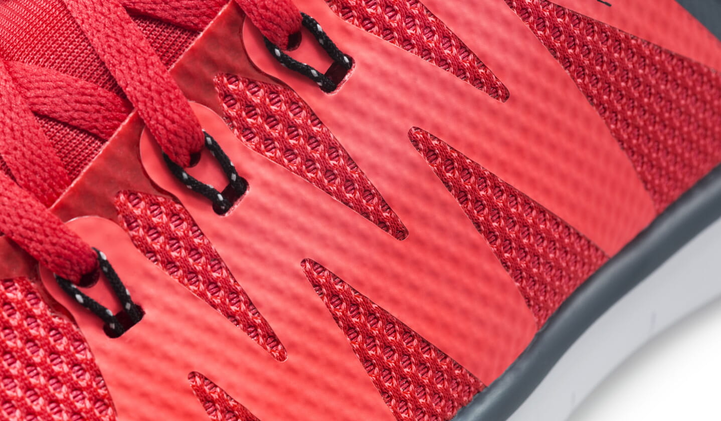
Internal zoom
Zoom inside the image by setting thezoomPosition parameter to inner value.<a href="large.jpg" class="MagicZoom" data-options="zoomPosition: inner"><img src="small.jpg"></a>
Placeholder
You can position the zoomed image literally anywhere on your page if you create a placeholder (e.g.<div id="zoom-placeholder">) and reference it with an unique #id in zoomPosition setting.
<a href="large.jpg" class="MagicZoom" data-options="zoomPosition: #zoom-placeholder;"><img src="small.jpg"></a>


<style>
  #zoom-placeholder {
    position: fixed;
    bottom: 25px;
    left: 10px;
    z-index: 100;
    width: 250px;
    height: 250px;
  }
</style>
Distance
Change the distance from the main image to the zoom (default is 15px) with thezoomDistance parameter. Example:
<a href="large.jpg" class="MagicZoom" data-options="zoomDistance: 150"><img src="small.jpg"></a>
Zoom mode
Magic Zoom Plus offers 3 ways to zoom images: Zoom, Magnifier and Preview.Zoom
By default, it will zoom on hover. Your code will look like this:<a href="large.jpg" class="MagicZoom"><img src="small.jpg"></a>
Magnifier
To use the elegant magnifying glass effect set thezoomMode parameter as magnifier. The default size is 70% of the image. If you prefer magnifier as a square, add mz-square to the cssClass setting:<a href="large.jpg" class="MagicZoom" data-options="zoomMode: magnifier"><img src="small.jpg"></a>
To control the magnifier width with your mousewheel, also add variableZoom parameter as true. Example:
<a href="large.jpg" class="MagicZoom" data-options="zoomMode: magnifier; variableZoom: true"><img src="small.jpg"></a>
Preview
You can show the entire large image on hover instead of part of the image. This is an excellent way to immediately show more detail for small images, such as on search results pages or category pages on an e-commerce site.
<a href="large.jpg" class="MagicZoom" data-options="zoomMode: preview; expand: off;"><img src="small.jpg"></a>
Off
Turn off the zoom effect so that image only enlarge to full-screen. Set thezoomMode option to off:<a href="large.jpg" class="MagicZoom" data-options="zoomMode: off"><img src="small.jpg"></a>
Gallery
You can combine multiple images into a gallery by adding anid attribute to the main image link and a data-zoom-id attribute to the alternative image links. Use href attribute of the alternative image link to specify an URL to the zoom image and data-image for the path to the small image.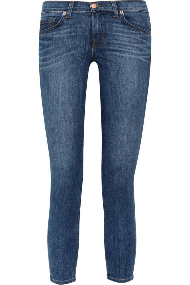
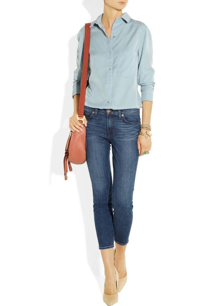
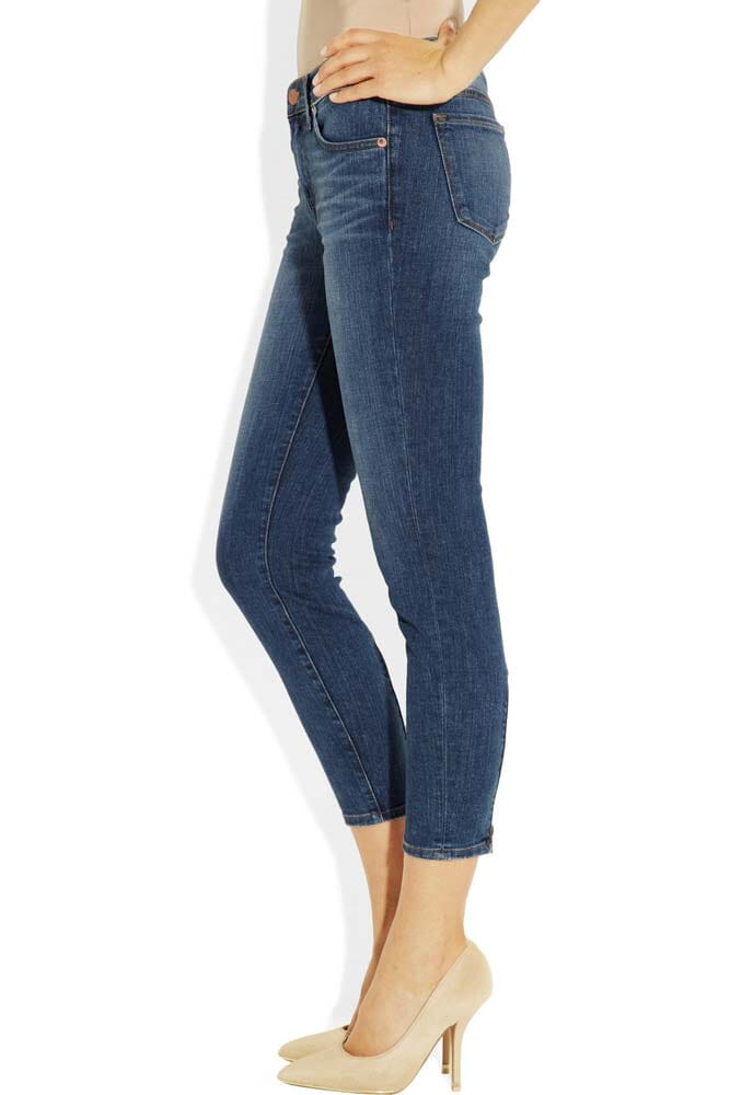
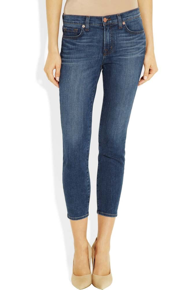

<a href="jeans1-big.jpg" class="MagicZoom" id="jeans"><img src="jeans1-small.jpg"></a>

<a data-zoom-id="jeans" href="jeans1-big.jpg" data-image="jeans1-small.jpg"><img src="jeans1-tiny.jpg"></a>
<a data-zoom-id="jeans" href="jeans2-big.jpg" data-image="jeans2-small.jpg"><img src="jeans2-tiny.jpg"></a>
<a data-zoom-id="jeans" href="jeans3-big.jpg" data-image="jeans3-small.jpg"><img src="jeans3-tiny.jpg"></a>
<a data-zoom-id="jeans" href="jeans4-big.jpg" data-image="jeans4-small.jpg"><img src="jeans4-tiny.jpg"></a>
<a data-zoom-id="jeans" href="jeans5-big.jpg" data-image="jeans5-small.jpg"><img src="jeans5-tiny.jpg"></a>
selectorTrigger: hover. To turn off a dissolve effect, set the transitionEffect to false: <a href="jeans1-big.jpg" class="MagicZoom" id="jeans" data-options="selectorTrigger: hover; transitionEffect: false;"><img src="jeans1-small.jpg"></a> <a data-zoom-id="jeans" href="jeans1-big.jpg" data-image="jeans1-small.jpg"><img src="jeans1-tiny.jpg"></a> <a data-zoom-id="jeans" href="jeans2-big.jpg" data-image="jeans2-small.jpg"><img src="jeans2-tiny.jpg"></a> <a data-zoom-id="jeans" href="jeans3-big.jpg" data-image="jeans3-small.jpg"><img src="jeans3-tiny.jpg"></a> <a data-zoom-id="jeans" href="jeans4-big.jpg" data-image="jeans4-small.jpg"><img src="jeans4-tiny.jpg"></a> <a data-zoom-id="jeans" href="jeans5-big.jpg" data-image="jeans5-small.jpg"><img src="jeans5-tiny.jpg"></a>

<a href="large1.jpg" class="MagicZoom" data-gallery="gallery" data-options="hint:false; zoomMode:off;"><img src="small1.jpg"></a>
<a href="large2.jpg" class="MagicZoom" data-gallery="gallery" data-options="hint:false; zoomMode:off;"><img src="small2.jpg"></a>
<a href="large3.jpg" class="MagicZoom" data-gallery="gallery" data-options="hint:false; zoomMode:off;"><img src="small3.jpg"></a>
<a href="large4.jpg" class="MagicZoom" data-gallery="gallery" data-options="hint:false; zoomMode:off;"><img src="small4.jpg"></a>
Gallery arrows
Left/right arrows are an effective way to encourage users to flick to the next/previous image in your gallery. Set cssClass parameter to mz-show-arrows:
<a href="jeans1-big.jpg" class="MagicZoom" id="jeans" data-options="cssClass: mz-show-arrows;"><img src="jeans1-small.jpg"></a>

<a data-zoom-id="jeans" href="jeans1-big.jpg" data-image="jeans1-small.jpg"><img src="jeans1-tiny.jpg"></a>
<a data-zoom-id="jeans" href="jeans2-big.jpg" data-image="jeans2-small.jpg"><img src="jeans2-tiny.jpg"></a>
<a data-zoom-id="jeans" href="jeans3-big.jpg" data-image="jeans3-small.jpg"><img src="jeans3-tiny.jpg"></a>
<a data-zoom-id="jeans" href="jeans4-big.jpg" data-image="jeans4-small.jpg"><img src="jeans4-tiny.jpg"></a>
<a data-zoom-id="jeans" href="jeans5-big.jpg" data-image="jeans5-small.jpg"><img src="jeans5-tiny.jpg"></a>
Gallery thumbnails
Choose how gallery thumbnail images are highlighted. By default, a sleek line displays under each image when selected. For a complete shaded highlight please set cssClass parameter to thumbnails-style-shaded:
<a href="jeans1-big.jpg" class="MagicZoom" id="jeans" data-options="cssClass: thumbnails-style-shaded;"><img src="jeans1-small.jpg"></a>

<a data-zoom-id="jeans" href="jeans1-big.jpg" data-image="jeans1-small.jpg"><img src="jeans1-tiny.jpg"></a>
<a data-zoom-id="jeans" href="jeans2-big.jpg" data-image="jeans2-small.jpg"><img src="jeans2-tiny.jpg"></a>
<a data-zoom-id="jeans" href="jeans3-big.jpg" data-image="jeans3-small.jpg"><img src="jeans3-tiny.jpg"></a>
<a data-zoom-id="jeans" href="jeans4-big.jpg" data-image="jeans4-small.jpg"><img src="jeans4-tiny.jpg"></a>
<a data-zoom-id="jeans" href="jeans5-big.jpg" data-image="jeans5-small.jpg"><img src="jeans5-tiny.jpg"></a>
mz-show-arrows) and full thumbnail highlight (thumbnails-style-shaded), your code will look like this:<a href="jeans1-big.jpg" class="MagicZoom" id="jeans" data-options="cssClass: mz-show-arrows thumbnails-style-shaded;"><img src="jeans1-small.jpg"></a> <a data-zoom-id="jeans" href="jeans1-big.jpg" data-image="jeans1-small.jpg"><img src="jeans1-tiny.jpg"></a> <a data-zoom-id="jeans" href="jeans2-big.jpg" data-image="jeans2-small.jpg"><img src="jeans2-tiny.jpg"></a> <a data-zoom-id="jeans" href="jeans3-big.jpg" data-image="jeans3-small.jpg"><img src="jeans3-tiny.jpg"></a> <a data-zoom-id="jeans" href="jeans4-big.jpg" data-image="jeans4-small.jpg"><img src="jeans4-tiny.jpg"></a> <a data-zoom-id="jeans" href="jeans5-big.jpg" data-image="jeans5-small.jpg"><img src="jeans5-tiny.jpg"></a>
Expanded view
Expanded view displays the enlarged image in a distraction free mode. Click on image to open an expanded view: <a href="large.jpg" class="MagicZoom" data-options="expand: window"><img src="small.jpg"></a>
← and → keys on keyboard or swipe gestures on touch screens. Use × icon or Esc key to close the expanded view. You can also close the expanded view by clicking anywhere outside the large image. Should you wish to disable this option, simply set closeOnClickOutside to false:<a href="large.jpg" class="MagicZoom" data-options="closeOnClickOutside: false"><img src="small.jpg"></a>
Full screen
By default the expanded view is set towindow mode. This means it is stretched to the full size of the browser window. To show expanded view in the full-screen mode use expand: fullscreen option.<a href="large.jpg" class="MagicZoom" data-options="expand: fullscreen"><img src="small.jpg"></a>
Zoom and pan
If the large image is bigger than the viewport, it will be scaled down. The user can zoom and pan image by clicking on it. Alternatively, you can configure Magic Zoom Plus to zoom in image automatically with theexpandZoomOn: always parameter:<a href="large.jpg" class="MagicZoom" data-options="expandZoomOn: click"><img src="small.jpg"></a>
expandZoomMode option is set to zoom). To allow visitors to magnify a portion of the image around mouse pointer with a loupe, use expandZoomMode: magnifier. You can disable image magnification in the expanded view with the expandZoomMode: off:<a href="large.jpg" class="MagicZoom" data-options="expandZoomMode: zoom"><img src="small.jpg"></a>
Background
Magic Zoom Plus displays a blurred background in the expanded view. If you prefer a plain background, you can setcssClass parameter to dark-bg for the translucent dark background, or use white-bg for the opaque white background:<a href="large.jpg" class="MagicZoom" data-options=""><img src="small.jpg"></a>
magiczoomplus.css file:.mz-expand .mz-expand-bg { display:none !important; }
.mz-expand { background-color: rgba(0,0,0,0.5) !important; }
0,0,0 defines background colour in RGB format / 0.5 defines opacity. Choose between 0 (transparent) and 1 (solid). If you do not want to set a background colour only set opacity as transparent, add the code below to the bottom of the magiczoomplus.css file instead:.mz-expand-bg { display:none !important; }
.mz-expand { background:transparent !important; }
Thumbnails
Thumbnail position
If your images are displayed as an image gallery, the thumbnail images automatically display in the expanded view under the main image. To change thumbnail position to the left, setcssClass parameter to expand-thumbnails-left: <a href="trainer1-big.jpg" class="MagicZoom" id="trainer" data-options="cssClass: expand-thumbnails-left"><img src="trainer1-small.jpg"></a> <a data-zoom-id="trainer" href="trainer1-big.jpg" data-image="trainer1-small.jpg"><img src="trainer1-tiny.jpg"></a> <a data-zoom-id="trainer" href="trainer2-big.jpg" data-image="trainer2-small.jpg"><img src="trainer2-tiny.jpg"></a> <a data-zoom-id="trainer" href="trainer3-big.jpg" data-image="trainer3-small.jpg"><img src="trainer3-tiny.jpg"></a>
Group thumbnails
If images combined into a gallery, the thumbnails are displayed underneath the image in the expanded view. To remove thumbnails, simply putno-expand-thumbnails into the cssClass parameter:<a href="large.jpg" class="MagicZoom" data-options="cssClass: no-expand-thumbnails"><img src="small.jpg"></a>For images which aren't part of a gallery (spread around web page) you can still group them together so they will appear as thumbnails in the expanded view. This is achieved using
data-gallery attribute in the <a> tag. Images can be combined so they all appear in the same expanded view, for example these images are all using group:<a href="big1.jpg" class="MagicZoom" data-gallery="group"><img src="small1.jpg"></a> <a href="big2.jpg" class="MagicZoom" data-gallery="group"><img src="small2.jpg"></a> <a href="big3.jpg" class="MagicZoom" data-gallery="group"><img src="small3.jpg"></a> <a href="big4.jpg" class="MagicZoom" data-gallery="group"><img src="small4.jpg"></a> <a href="big5.jpg" class="MagicZoom" data-gallery="group"><img src="small5.jpg"></a> <a href="big6.jpg" class="MagicZoom" data-gallery="group"><img src="small6.jpg"></a>But if different images relate to specific subjects, you can choose which images are shown as thumbnails in the enlarged view. As long as the
data-gallery name is the same, the images will be grouped, for example:<a href="big1.jpg" class="MagicZoom" data-gallery="group1"><img src="small1.jpg"></a> <a href="big2.jpg" class="MagicZoom" data-gallery="group1"><img src="small2.jpg"></a> <a href="big3.jpg" class="MagicZoom" data-gallery="group2"><img src="small3.jpg"></a> <a href="big4.jpg" class="MagicZoom" data-gallery="group2"><img src="small4.jpg"></a> <a href="big5.jpg" class="MagicZoom" data-gallery="group3"><img src="small5.jpg"></a> <a href="big6.jpg" class="MagicZoom" data-gallery="group3"><img src="small6.jpg"></a>
Hint
A hint is displayed on the image to indicate that the image is zoomable and can be controlled with thehint option. By default the hint appears once and hides after the first interaction with the image. You can configure hint to always appear on the image with hint: always. To remove hint, set hint parameter to off:<a class="MagicZoom" href="large.jpg" data-options="hint: once">
<img src="small.jpg">
</a>
textHoverZoomHint option if zoom activates on hover or textClickZoomHint if zoom activates on click:<a class="MagicZoom" href="large.jpg" data-options="expand: off; hint: always; textHoverZoomHint: Roll over image to zoom in; textClickZoomHint: Click image to zoom in"><img src="small.jpg"></a>
textExpandHint property:<a class="MagicZoom" href="large.jpg" data-options="zoomMode: off; textExpandHint: Click to open expanded view">
<img src="small.jpg">
</a>
Caption
Add a caption to the image by usingtitle attribute in the <a> tag:<a class="MagicZoom" title="This is a dummy caption" href="large.jpg"><img src="small.jpg"></a>By default the caption appears only in the expanded view. To show caption on the zoomed image, set
zoomCaption parameter to top or bottom position:<a class="MagicZoom" data-options="zoomCaption: top" href="large.jpg"><img src="small.jpg"></a>
data-link attribute:<a href="large.jpg" class="MagicZoom" title="Caption text can link to any URL" data-link="#caption-with-link">
<img src="small.jpg">
</a>
expandCaption: false.Click to zoom
If you do not want to zoom image immediately on hover, you can configure Magic Zoom Plus to activate zoom on click:<a href="large.jpg" class="MagicZoom" data-options="zoomOn: click"><img src="small.jpg"></a>
Lazy zoom
For the best user experience Magic Zoom Plus preloads the large image. However, you can configure it to load large image on demand (lazy-loading) withlazyZoom: true option. This means the large image will be loaded when the user triggers zoom or opens expanded view:<a href="large.jpg" class="MagicZoom" data-options="lazyZoom: true"><img src="small.jpg"></a>If displaying images in a gallery layout, lazyZoom applies to both big and small sized images (not tiny images).
Autostart
Magic Zoom Plus starts automatically when page is loaded by default. To start it manually setautostart parameter to false:<a href="large.jpg" class="MagicZoom" data-options="autostart: false"><img src="small.jpg"></a>
Retina images
Optimize your images for Retina / High DPI displays with 2x images. Adddata-zoom-image-2x attribute to the <a class="MagicZoom"> tag for a high-resolution large image and data-image-2x attribute for a small HD image:<a href="large.jpg" data-zoom-image-2x="large@2x.jpg" data-image-2x="small@2x.jpg" class="MagicZoom">
<img src="small.jpg">
</a>
Styling
Control the look and feel of your images by using CSS.Zoom window
Use the following CSS classes in your stylesheets to customize zoom window shape; border; background + more:.mz-zoom-window {
/* Applies in the default zoom mode */
}
.mz-zoom-window.mz-magnifier {
/* Applies in the magnifier mode */
}
.mz-zoom-window.mz-preview {
/* Applies in the preview mode */
}
.mz-zoom-window.mz-inner {
/* Applies in internal zoom */
}
Bounce effect
A growing bounce effect is used, if this animation doesn't suit your page experience, it can be disabled by adding the following CSS to your magiczoomplus.css file:.mobile-magic .mz-figure > img {
opacity: 1 !important;
}
.mobile-magic .mz-figure > img + img {
transform: scale(1) !important;
}
.mobile-magic .mz-figure {
perspective: none !important;
}
.mobile-magic .mz-figure > img {
opacity: 1 !important;
}
.mobile-magic .mz-figure:not(.mz-ready) > img:last-child {
transform: scale(1) !important;
}
Lens
Alter the look of the lens over the image in the zoom mode with.mz-lens class:.mz-lens {
/* Applies to the lens over the image */
}
Caption
Control the styles of the caption with these CSS:.mz-zoom-window .mz-caption {
/* Applies to the caption in zoom window */
}
.mz-expand .mz-caption {
/* Applies to the caption in expanded view */
}
Gallery
Customize look & feel of the thumbnails in a gallery using the CSS below:.mz-thumb {
/* Applies to every thumbnail */
}
.mz-thumb-selected {
/* Applies to the active thumbnail */
}
You can either add the style to one of your external CSS files or you can place it directly into the HTML of your page. If placing the style in your HTML page, use <style> tags, for example:<style>
.mz-thumb {
border: 1px;
}
.mz-thumb-selected {
filter: brightness(100%);
}
</style>
The style can go anywhere in your HTML page after the magiczoom.css file.API & callbacks
API methods
You can use the Magic Zoom Plus API commands to control your images dynamically:MagicZoom.start(node)- Start Magic Zoom Plus instance by#idor reference to<a>tag. Without parameters, start all instances on the page.MagicZoom.stop(node)- Stop Magic Zoom Plus instance by#idor reference to<a>tag. Without parameters, stop all instances on the page.MagicZoom.refresh(node)- Reload Magic Zoom Plus instance by#idor reference to<a>. Without parameters, reload all instances on the page.MagicZoom.update(node, large-image-url, small-image-url)- Update particular zoom by #id.MagicZoom.prev(node)- Go to the previous image of a particular zoom.MagicZoom.next(node)- Go to the next image of a particular zoom.MagicZoom.switchTo(node, selector)- Switch to a particular image by selector.selector- is either reference to selector's DOM element or index number of the selector (index number starts from 0).MagicZoom.zoomIn(node)- Activate zoom mode on a particular zoom.MagicZoom.zoomOut(node)- Deactivate zoom mode on a particular zoom.MagicZoom.expand(node)- Open expanded view of a particular zoom.MagicZoom.close(node)- Close expanded view of a particular zoom.
Callbacks
onZoomReady: function(zoom_id){ }- Fires when zoom instance is ready to operate.onUpdate: function(zoom_id, previous_image_selector, new_image_selector){ }- Fires when images swapped.onZoomIn: function(zoom_id){ }- Fires when zoom mode activated.onZoomOut: function(zoom_id){ }- Fires when zoom mode deactivated.onExpandOpen: function(zoom_id){ }- Fires when expanded view opened.onExpandClose: function(zoom_id){ }- Fires when expanded view closed.
<script>
    var mzOptions = {};
    mzOptions = {
        onZoomReady: function() {
            console.log('onReady', arguments[0]);
        },
        onUpdate: function() {
            console.log('onUpdated', arguments[0], arguments[1], arguments[2]);
        },
        onZoomIn: function() {
            console.log('onZoomIn', arguments[0]);
        },
        onZoomOut: function() {
            console.log('onZoomOut', arguments[0]);
        },
        onExpandOpen: function() {
            console.log('onExpandOpen', arguments[0]);
        },
        onExpandClose: function() {
            console.log('onExpandClosed', arguments[0]);
        }
    };
</script>
Parameters
Configure Magic Zoom Plus for your needs with the parameters listed below. Apply parameters via thedata-options attribute, with multiple parameters separated by a semi-colon, for example:<a href="large.jpg" class="MagicZoom" data-options="expand:fullscreen; rightClick:true;"><img src="small.jpg"></a>Or parameters can be set globally with the
mzOptions variable, e.g.:<script>
var mzOptions = {
expand: 'fullscreen',
rightClick: 'true'
};
</script>
>| Parameter | Default | Options | Description |
|---|---|---|---|
| zoomMode | zoom | zoom | magnifier | preview | off | How to zoom image |
| zoomOn | hover | hover | click | When activate zoom |
| zoomPosition | right | left | right | top | bottom | inner | Position of zoom window |
| zoomWidth | auto | <percentage> | <pixels> | auto | Width of zoom window |
| zoomHeight | auto | <percentage> | <pixels> | auto | Height of zoom window |
| zoomDistance | 15 | <pixels> | Distance from small image to zoom window |
| zoomCaption | off | top | bottom | off | Position of caption on zoomed image |
| hint | once | once | always | off | How to show hint |
| variableZoom | false | true | false | Whether to allow changing zoom ratio with mouse wheel |
| smoothing | true | true | false | Enable/disable smooth zoom movement |
| expand | window | window | fullscreen | off | How to show expanded view |
| expandZoomMode | zoom | zoom | magnifier | off | How to zoom image in expanded view |
| expandZoomOn | click | click | always | When and how activate zoom in expanded view. 'always' - zoom automatically activates upon entering the expanded view and remains active. |
| expandCaption | true | true | false | Whether to show caption in expanded view |
| closeOnClickOutside | true | true | false | Whether to close expanded view on click outside the image |
| lazyZoom | false | true | false | Whether to load large image on demand (on first activation) |
| rightClick | false | true | false | Whether to allow context menu on right click |
| upscale | true | true | false | Whether to scale up the large image if its original size is not enough for a zoom effect |
| selectorTrigger | click | click | hover | Mouse event used to swtich between multiple images |
| transitionEffect | true | true | false | Whether to enable dissolve effect when switching between images |
| autostart | true | true | false | Whether to start Zoom on image automatically on page load or manually |
| cssClass | string | Extra CSS class(es) to apply to zoom instance | |
| history | true | true | false | Whether disable exit fullscreen with the browser back button or not. |
| textHoverZoomHint | Hover to zoom | string | Hint that shows when zoom mode is enabled, but inactive. Zoom activates on hover (zoomOn: hover) |
| textClickZoomHint | Click to zoom | string | Hint that shows when zoom mode is enabled, but inactive. Zoom activates on click (zoomOn: click) |
| textExpandHint | Click to expand | string | Hint that shows when zoom mode activated, or in inactive state if zoom mode is disabled |
| textBtnClose | Close | string | Text label that appears on mouse over the "close" button in expanded view |
| textBtnPrev | Previous | string | Text label that appears on mouse over the "previous" button arrow in expanded view |
| textBtnNext | Next | string | Text label that appears on mouse over the "next" button arrow in expanded view |
Options for mobile devices
For mobile devices (smartphones in particular), global parameters can be overwritten with the mzMobileOptions variable:
<script>
var mzMobileOptions = {
  zoomMode: 'magnifier'
};
</script>
or locally via the data-mobile-options attribute:<a class="MagicZoom" data-mobile-options="zoomMode: magnifier;"> </a>
| Parameter | Default | Options | Description |
|---|---|---|---|
| zoomMode | zoom | zoom | magnifier | off | How to zoom image |
| textHoverZoomHint | Touch to zoom | string | Hint that shows when zoom mode is enabled, but inactive. Zoom activates on hover (zoomOn: hover) |
| textClickZoomHint | Double tap or pinch to zoom | string | Hint that shows when zoom mode is enabled, but inactive. Zoom activates on click (zoomOn: click) |
| textExpandHint | Tap or pinch to expand | string | Hint that shows when zoom mode activated, or in inactive state if zoom mode is disabled |