Install this beautiful photo slideshow on your website.
Getting started
If you're using one of these platforms, click your platform and follow the instructions to install the Magic Slideshow module:
If you're not using one of the platforms above, install Magic Slideshow like so:
- Download the Magic Slideshow demo (zip).
- Unzip the file on your computer and FTP the magicslideshow folder to your website directory (on your server), keeping the file and folder structure intact.
Reference the magicslideshow.js and magicslideshow.css files before your </head> tag. For example:
<link rel="stylesheet" href="magicslideshow/magicslideshow.css">
<script src="magicslideshow/magicslideshow.js"></script>
If you cannot access the
headsection of your page, reference the files elsewhere such as the main content of your page.- Create a <div> with the class MagicSlideshow.
Place your images in the <div>, for example:
<div class="MagicSlideshow"> <img src="example1.jpg"> <img src="example2.jpg"> <img src="example3.jpg"> </div>- That's it! Continue reading to change the size, slide effects, speed, captions and other settings. Try all the parameters and see which suits your slideshow best.
To remove the Magic Slideshow trial version message, buy a license then overwrite the
magicslideshow.jsfile with your licensed version.
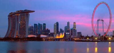
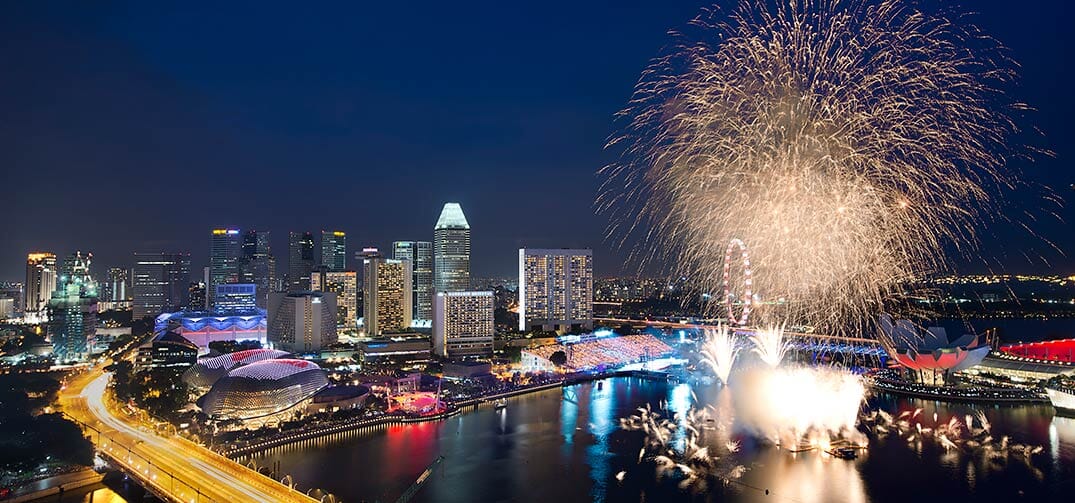
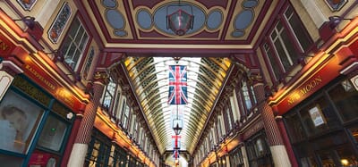
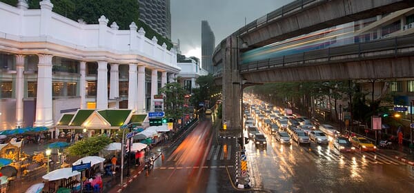
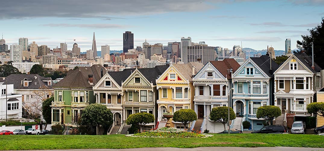
This is how a basic slideshow looks:


This page has all the HTML you need to customize Magic Slideshow exactly how you want. Get inspired from these examples. If you're not confident using HTML, use the settings wizard to create the HTML code for you. If you have any questions contact us and we'll help you.
Slideshow size
You can choose the width and height of your slideshow or leave Magic Slideshow to set the dimensions via these defaults:
- Width : 100% of the parent area (e.g. the div or td of your page).
- Height : 62.5% of the width (that's a 16:10 aspect ratio).
Use this calculation for the slideshow to fit perfectly in the space available: [image height]/[image width]*100%.
For example: 1350/2880*100% = 0.46875 = 46.87% height setting (always use 100% width setting).
If dimensions are automatically set by Magic Slideshow, the slideshow will look like this:


<div class="MagicSlideshow">
    <img src="example1.jpg">
    <img src="example2.jpg">
    <img src="example3.jpg">
</div>
To control the exact size of your slideshow, set the width and height in either px or %.


<div class="MagicSlideshow" data-options="width: 400px; height:187px;">
    <img src="example1.jpg">
    <img src="example2.jpg">
    <img src="example3.jpg">
</div>
This next example uses 40% width. The parent on this particular page is a div of 430px width, so the slideshow width will be less than half of that:


<div class="MagicSlideshow" data-options="width: 40%;">
    <img src="example1.jpg">
    <img src="example2.jpg">
    <img src="example3.jpg">
</div>
Slideshows are responsive - if a users' display is smaller than your slideshow width, it will automatically scale down to fit their display, no matter whether you use px (pixel) or % (percentage).
Slide effects
Choose from a slick range of 14 image effects, including: slide (default), fade, fade-up, fade-down, dissolve, cube, bars3d, slide-in, slide-out, flip, blinds3d, slide-change, diffusion, blocks or choose random to use them all). To select effect, use the effect parameter.
Pick your favourite: click below to try each effect:


<div class="MagicSlideshow" data-options="">
    <img src="example1.jpg">
    <img src="example2.jpg">
    <img src="example3.jpg">
    ...
</div>
Alternatively, use a mixture of all the transition effects by setting effect to random:


<div class="MagicSlideshow" data-options="effect: random; effect-speed:1500; slide-duration:1500;">
    <img src="example1.jpg">
    <img src="example2.jpg">
    <img src="example3.jpg">
    ...
</div>
You can adjust the speed of the slide transition effect by changing effect-speed (default speed is 600ms). This next example has a much faster fade-down effect (200ms):


<div class="MagicSlideshow" data-options="effect: fade-down; effect-speed: 200;">
    <img src="example1.jpg">
    <img src="example2.jpg">
    <img src="example3.jpg">
    ...
</div>
Slideshow speed
You can change the length of time each slide is shown using slide-duration. You can also change the speed of the slide effects transition (choose from 14 effects) using effect-speed.
In the example below, each slide is shown for 3 seconds (normally 6000 milliseconds / 6 seconds) and the fade effect lasts 2.5 seconds (normally 600 milliseconds / 0.6 seconds):
<div class="MagicSlideshow" data-options="effect:dissolve; slide-duration: 3000; effect-speed:2500;">
    <img src="example1.jpg">
    <img src="example2.jpg">
    <img src="example3.jpg">
    ...
</div>
Navigation
How would you like visitors to interact with your slideshows? There are a variety of options to choose from. A popular choice is thumbnails or you may prefer bullets. By default, arrows automatically show when a slide is hovered. Or you may choose not to use any navigation and opt for a progress bar with autoplay instead.
Remember, you can vary the look of each slideshow by using a different navigation option for each one.
Autoplay
By default, your slideshow will automatically play. Each slide will change itself without the user controlling movement. If you wish to turn autoplay off, simply use autoplay: false.
<div class="MagicSlideshow" data-options="autoplay: false;">
    <img src="example1.jpg">
    <img src="example2.jpg">
    <img src="example3.jpg">
</div>
Thumbnails
Thumbnails are a great way to navigate through your slideshow. For thumbnails to show you must use two parameters. The selectors-style: thumbnails and selectors attribute for the thumbnail position.
How you design your thumbnails is up to you. From size to position; using the same image for your slide & thumbnail or a completely different image. There are also options to customize the thumbnail area; use a selectors eye; only show thumbnails in the area; and show thumbnails as text or text & images.
By default, the size of the thumbnails display as 70 pixels. You can choose any width for your thumbnails. This example shows 60px width thumbnails:
<div class="MagicSlideshow" data-options="selectors-style: thumbnails; selectors: bottom; selectors-size: 60px;">
    <img src="example1.jpg">
    <img src="example2.jpg">
    <img src="example3.jpg">
</div>
Thumbnails can be positioned top, left, bottom or right of the main slideshow (default position is none). You can change the location of thumbnails with the selectors option, for example:
<div class="MagicSlideshow" data-options="selectors: right; selectors-style: thumbnails; selectors-size: 40px;">
    <img src="example1.jpg">
    <img src="example2.jpg">
    <img src="example3.jpg">
    ...
</div>
Instead of having Magic Slideshow downsize your main images, you can use another set of images as your thumbnails. Reference them with data-thumb-image like so:
<div class="MagicSlideshow" data-options="selectors: bottom; selectors-style: thumbnails; selectors-size: 50px;">
    <img src="example1.jpg" data-thumb-image="example1-thumb.jpg">
    <img src="example2.jpg" data-thumb-image="example2-thumb.jpg">
    <img src="example3.jpg" data-thumb-image="example3-thumb.jpg">
</div>
By default, the current thumbnail is highlighted with a white box using a parameter called selectors-eye. You can adjust the style of the highlighting (thickness, color, shadow) via the CSS. Or you can turn it off by using selectors-eye: false:
<div class="MagicSlideshow" data-options="selectors: top; selectors-style: thumbnails; selectors-eye: false;">
    <img src="example1.jpg">
    <img src="example2.jpg">
    <img src="example3.jpg">
</div>
There are many ways to display how your thumbnails look using Magic Slideshow's settings. But if you're an experienced developer, you can customize the thumbnail area exactly how you want. All you need is a little imagination...


<style>
    .MagicSlideshow .mss-selectors-wrapper {
        background: #fbd2ee;
        background: -webkit-linear-gradient(top, #fbd2ee 0%, #f5f1c9 100%);
        background: -moz-linear-gradient(top, #fbd2ee 0%, #f5f1c9 100%);
        background: -ms-linear-gradient(top, #fbd2ee 0%, #f5f1c9 100%);
        background: -0-linear-gradient(top, #fbd2ee 0%, #f5f1c9 100%);
        background: linear-gradient(top, #fbd2ee 0%, #f5f1c9 100%);
    }
    .MagicSlideshow .mss-selectors-container {
        text-align: left !important;
        width: 100% !important;
        height: 100% !important;
    }
    .MagicSlideshow .mss-selectors-container .mss-selector {
        margin: 5px !important;
        text-align: center;
        width: 50px !important;
        clear: both;
    }
</style>
<div class="MagicSlideshow" data-options="selectors-style: thumbnails; selectors: right; selectors-size: 245;">
    <img src="example1.jpg" data-thumb-image="example1-thumb.jpg">
    <img src="example2.jpg" data-thumb-image="example2-thumb.jpg">
    <img src="example3.jpg" data-thumb-image="example3-thumb.jpg">
    ...
</div>
By default, arrows show on either side of the thumbnails. You can change this to show only thumbnails, completely filling the area using selectors-fill: true; parameter.
<div class="MagicSlideshow" data-options="selectors-style: thumbnails; selectors-fill: true; selectors: bottom; selectors-size: 20; selectors-eye: false;">
    <img src="example1.jpg" data-thumb-image="example1-thumb.jpg">
    <img src="example2.jpg" data-thumb-image="example2-thumb.jpg">
    <img src="example3.jpg" data-thumb-image="example3-thumb.jpg">
    ...
</div>
You can customize HTML slideshows any way you want. That includes thumbnails!
Showing images and text as your thumbnails is a great promotional tool. To achieve this effect use data-mss-thumbnail. The example below uses different images for thumbnails and also includes style padding for each:
 Thumbnail 1 with a descriptive text inside
 Thumbnail 2 with a descriptive text inside
 Thumbnail 3 with a descriptive text inside
<div class="MagicSlideshow" data-options="selectors-style: thumbnails; selectors: bottom; selectors-size: 70;">
    <div><img src="example1-main.jpg"><div data-mss-thumbnail style="max-width: 200px;"><img src="example1-thumb.jpg" style="vertical-align: middle;"><span style="padding:0 10px;white-space: initial;display: inline-block;width: 50%;vertical-align: middle;">Thumbnail 1 with a descriptive text inside</span></div></div>
    <div><img src="example2-main.jpg"><div data-mss-thumbnail style="max-width: 200px;"><img src="example2-thumb.jpg" style="vertical-align: middle;"><span style="padding:0 10px;white-space: initial;display: inline-block;width: 50%;vertical-align: middle;">Thumbnail 2 with a descriptive text inside</span></div></div>
    <div><img src="example3-main.jpg"><div data-mss-thumbnail style="max-width: 200px;"><img src="example3-thumb.jpg" style="vertical-align: middle;"><span style="padding:0 10px;white-space: initial;display: inline-block;width: 50%;vertical-align: middle;">Thumbnail 3 with a descriptive text inside</span></div></div>
</div>
Or you may prefer to only show text as your thumbnails using data-mss-thumbnail. The example below uses one style padding for all thumbnails:
Thumbnail 1
Thumbnail 2
Thumbnail 3
Thumbnail 4
Thumbnail 5
Thumbnail 6
Thumbnail 7
<style>
.MagicSlideshow div[data-mss-thumbnail] {
    padding: 5px;
}
</style>
<div class="MagicSlideshow" data-options="selectors-style: thumbnails; selectors: right; selectors-size: 100;">
    <div><img src="example1.jpg"><div data-mss-thumbnail><b>Title 1</b><br>Thumbnail 1</div></div>
    <div><img src="example2.jpg"><div data-mss-thumbnail><b>Title 2</b><br>Thumbnail 2</div></div>
    <div><img src="example3.jpg"><div data-mss-thumbnail><b>Title 3</b><br>Thumbnail 3</div></div>
    ...
</div>
Bullets
Instead of using thumbnails, you can switch between slides using bullets. Bullets display a preview of upcoming slides, add an extra 40 pixels to the side of a slideshow and can be completely customized with CSS.
Set selectors-style to bullets and choose where you would like the bullets to be placed (top, bottom, left or right) using selectors parameter.
<div class="MagicSlideshow" data-options="selectors-style: bullets; selectors: bottom;">
    <img src="example1.jpg">
    <img src="example2.jpg">
    <img src="example3.jpg">
    ...
</div>
You will notice in the above demo a slide preview (tooltip) appears when each bullet is hovered. By default the preview position is top but you can also choose bottom or none using the bullets-preview parameter.
To switch the tooltip feature off, set bullets-preview to none.
<div class="MagicSlideshow" data-options="selectors-style: bullets; selectors: bottom; bullets-preview: none;">
    <img src="example1.jpg">
    <img src="example2.jpg">
    <img src="example3.jpg">
    ...
</div>
Bullets shown on the left or right side add an extra 40 pixel width to the slideshow, by default, so if you want the slideshow to be the same size as your images, specify the width with 40px added. In this case, the image width is 400px, so the slideshow width has been set at 440px:
<div class="MagicSlideshow" data-options="selectors-style: bullets; selectors: right; width: 440px; height: 46.75%;">
    <img src="example1.jpg">
    <img src="example2.jpg">
    <img src="example3.jpg">
    ...
</div>
Change the style of the bullets by editing the CSS in the magicslideshow.default.css file. The CSS example below will make the bullets larger:
.mss-bullets .mss-selector {
    width: 24px;
    height: 24px;
    border-radius: 4px;
    margin: 12px;
}
.mss-selectors-vertical .mss-bullets .mss-selectors-container {
    width: 24px;
}
#custom-bullets .mss-bullets .mss-selector:after {
    width: 12px;
    height: 12px;
    margin: 4px;
}
Arrows
By default, when a slide is hovered grey forward and backward arrows appear to the left and right. For vertical slideshows, the arrows appear at the top and bottom.
You can design the arrows by overriding the default CSS. The example below uses blue arrows:
<style>
.MagicSlideshow.mss-horizontal .mss-slider .mss-arrow-prev:before,
.MagicSlideshow.mss-horizontal .mss-slider .mss-arrow-next:before {
    border-color: rgb(26, 48, 219) !important;
}
</style>
<div class="MagicSlideshow">
    <img src="example1.jpg">
    <img src="example2.jpg">
    <img src="example3.jpg">
    ...
</div>
Also slideshow has a play button panel which is disabled by default. You can display the panel using CSS .MagicSlideshow .mss-button-play { display: block; }. For simplicity, the slideshow has a class of mss-control-bar. If you add it to the slideshow <div> container, the control bar appears when slide is hovered.
<div class="MagicSlideshow mss-control-bar" data-options="fullscreen: true;">
    <img src="example1.jpg">
    <img src="example2.jpg">
    <img src="example3.jpg">
    ...
</div>
Or if you don't want arrows to show on your slide, you can remove the arrows by using the arrows parameter like so:
<div class="MagicSlideshow" data-options="arrows: false;">
    <img src="example1.jpg">
    <img src="example2.jpg">
    <img src="example3.jpg">
    ...
</div>
Progress bar
If your slideshow doesn't use arrows, bullets or thumbnails to change slides, use show-loader:true. When any visitor hovers over the slideshow, a progress bar appears showing how long that slide will display before changing.
<div class="MagicSlideshow" data-options="show-loader:true; arrows:false;">
    <img src="example1.jpg">
    <img src="example2.jpg">
    <img src="example3.jpg">
</div>
Ken Burns slideshow
The Ken Burns effect is a popular technique for panning an image to make it look like you're slowly zooming in or out.

<div class="MagicSlideshow" data-options="kenburns: true;">
    <img src="example1.jpg">
    <img src="example2.jpg">
    <img src="example3.jpg">
    ...
</div>
Fullscreen slideshow
Show an impressive full-screen version of your slideshow by referencing large versions of your images with data-fullscreen-image, like so:
<div class="MagicSlideshow" data-options="fullscreen: true;">
    <img src="example1.jpg" data-fullscreen-image="example1-large.jpg">
    <img src="example2.jpg" data-fullscreen-image="example2-large.jpg">
    <img src="example3.jpg" data-fullscreen-image="example3-large.jpg">
</div>
Video slideshow
It's easy to make a slideshow of videos. This example shows left/right arrows on hover and has auto-sliding disabled:
<div class="MagicSlideshow" data-options="autoplay: false;">
    <iframe src="https://www.youtube.com/embed/tw4jkyfY4HE" frameborder="0" allow="encrypted-media"></iframe>
    <iframe data-video-fullsize="true" data-video-autoplay="true" src="https://player.vimeo.com/video/192130017" frameborder="0"></iframe>
</div>
Or show a mixture of videos and images:

<div class="MagicSlideshow">
    <iframe width="548" height="257" src="https://www.youtube.com/embed/E4DrF9X1-Cs" allowfullscreen></iframe>
    <iframe width="548" height="257" src="https://www.youtube.com/embed/v27iBE5qs5c" allowfullscreen></iframe>
    <img src="example1.jpg">
    <img src="example2.jpg">
</div>
To display videos from your own server, use this code:
<div class="MagicSlideshow">
    <div><img src="YOUR-IMAGE-NAME.jpg"></div>
    <div><img src="YOUR-IMAGE-NAME.jpg"></div>
    <div><video width="548" height="257" controls="autoplay"><source src="YOUR-VIDEO-NAME.mp4"></video></div>
    <div><video width="548" height="257" controls="autoplay"><source src="YOUR-VIDEO-NAME.mp4"></video></div>
</div>
Content
Create unique content for each slide with Magic Slideshow. Include URL links; captions or design your slides from scratch.
Link to URLs
Each image can link to a URL. Simply add a href to the link. Example:
<div class="MagicSlideshow">
    <a href="/"><img src="example1.jpg"></a>
    <a href="example.html"><img src="example2.jpg"></a>
    <a href="http://www.example.com/any-page/"><img src="example3.jpg"></a>
</div>
You can also add links within the text description. Example:
<div class="MagicSlideshow">
    <a href="/page-1/"><img src="example1.jpg" data-caption="You can add links [a href='ENTER-WEB-PAGE-URL-HERE']within the caption[/a]."></a>
    <a href="/page-2/"><img src="example2.jpg" data-caption="Any [a href='ENTER-WEB-PAGE-URL-HERE']number[/a] of [a href='ENTER-WEB-PAGE-URL-HERE']links[/a]."></a>
</div>
Text caption
You can add captions under each image using data-caption or in a span after the image.
You can also add larger text using the title tag, for example:
<div class="MagicSlideshow">
    <img src="example1.jpg" data-caption="Descriptive text can go here." title="Title here">
    <img src="example2.jpg" data-caption="You can have one or two sets of text, or none at all." title="Another title">
    <img src="example3.jpg" data-caption="You can use HTML such as <b>bold</b>, <i>italic</i> and <a href='/magicslideshow/'>links</a>.">
</div>
HTML content
A slideshow can be much more than just images. Magic Slideshow works with any HTML element so you can... Be creative. Be imaginative. Be inspiring.
What will you create with Magic Slideshow?
HTML content is perfect for slideshows
Gone are the days when slideshows can only display images.
Use HTML to create a plush looking slideshow for your site.
We've gathered some neat ways for you
to make your slideshows stand out...

HTML content is perfect for slideshows

HTML content is perfect for slideshows
Gone are the days when slideshows can only display images.
Use HTML to create a plush looking slideshow for your site.
We've gathered some neat ways for you
to make your slideshows stand out...
<div class="MagicSlideshow" data-options="width:600px; height: 300px;">
    <div>
        <img src="example-background.jpg" width="100%">
        <div style="background-color:rgba(255, 255, 255, 0.3);color:#666;position:absolute;text-align:center;left:50%;top:0;transform:translate(-50%);width:100%">
            <h3>HTML content is perfect for slideshows</h3>
            <p style="line-height: 160%; font-family: Helvetica,Arial,sans-serif; font-size: 14px;">Gone are the days when slideshows can only display images.<br>
            Use HTML to create a plush looking slideshow for your site.<br>
            We've gathered some neat ways for you<br>to make your slideshows stand out...</p>
        </div>
    </div>
    ...
    ...
</div>
Orientation
Scroll your slideshow vertically (up / down) instead of horizontally (right / left). Set the orientation parameter to vertical, like so:
<div class="MagicSlideshow" data-options="orientation: vertical;">
    <img src="example1.jpg">
    <img src="example2.jpg">
    <img src="example3.jpg">
    ...
</div>
Multiple slideshows
One page can have many slideshows (as this page does).
If you'd like each slideshow to have different options, use a data-options tag like in all the examples on this page.
If you'd like to set the same options for all slideshows on your page, you might prefer to use MagicSlideshowOptions like so:
<script>
var MagicSlideshowOptions = {
     'autoplay': true,
     'kenburns': true
};
</script>
To specify different CSS attributes for a particular slideshow, give it a unique ID, for example id="slide-blue":
<div class="MagicSlideshow" id="slide-blue" data-options="width: 400px; height 187px;">
    <img src="example1.jpg">
    <img src="example2.jpg">
    <img src="example3.jpg">
</div>
Use that ID to apply CSS only to that slideshow. This example adds a blue border to the slideshow below and extends the box shadow when slide is hovered:
#slide-blue {
    border: 12px solid #0073bd;
    box-shadow: 1px 1px 12px rgba(0, 0, 0, 0.5);
    transition: box-shadow .4s;
}
#slide-blue:hover {
    box-shadow: 9px 9px 12px rgba(0, 0, 0, 0.5);
}
Zoom your slideshow
You can add zoom and enlarge effects to each image in your slideshow by combining Magic Zoom Plus with Magic Slideshow.
Update your file references before your </head> tag. For example:
<link href="magiczoomplus/magiczoomplus.css" rel="stylesheet" media="screen">
<script src="magiczoomplus/magiczoomplus.js"></script>

<link href="magicslideshow/magicslideshow.css" rel="stylesheet" media="screen">
<script src="magicslideshow/magicslideshow.js"></script>

<style>
.mss-slide div {
    text-align:center;
}
.mss-slide figure.mz-figure {
    width: 100%;
    height: 100%;
}
</style>
Place the following code in the <body> tag of your web page. The example below uses thumbnails. Your zoomable slideshow will look like this:


<div class="MagicSlideshow" data-options="autoplay: false; selectors: bottom; selectors-style: thumbnails;">
    <a data-thumb-image="tiny1.jpg" href="big1.jpg" class="MagicZoom"><img src="small1.jpg"></a>
    <a data-thumb-image="tiny2.jpg" href="big2.jpg" class="MagicZoom"><img src="small2.jpg"></a>
    <a data-thumb-image="tiny3.jpg" href="big3.jpg" class="MagicZoom"><img src="small3.jpg"></a>
        ...
</div>
If you prefer to use bullets instead of thumbnails, please use this code in your <body> tag:


<div class="MagicSlideshow" data-options="autoplay: false; selectors: bottom; selectors-style: bullets;">
	<a href="big1.jpg" class="MagicZoom" data-options="autostart:false;"><img src="small1.jpg"></a>
	<a href="big2.jpg" class="MagicZoom" data-options="autostart:false;"><img src="small2.jpg"></a>
	<a href="big3.jpg" class="MagicZoom" data-options="autostart:false;"><img src="small3.jpg"></a>
        ...
</div>
Combine with 360 spin
Amaze visitors with a gorgeous JavaScript slideshow which includes 360 spins by simply combining Magic 360 with Magic Slideshow.
To create this incredible combination update your file references before your </head> tag. For example:
<link href="magic360/magic360.css" rel="stylesheet" media="screen">
<script src="magic360/magic360.js"></script>

<link href="magicslideshow/magicslideshow.css" rel="stylesheet" media="screen">
<script src="magicslideshow/magicslideshow.js"></script>
Place the following code in the <body> tag of your web page.
<div class="MagicSlideshow" data-options="width:600px; selectors-style: thumbnails; selectors: bottom; selectors-size: 70; autoplay: false">
        <div data-thumb-image="spin-example-thumb.jpg">
        <div align="center"><a class="Magic360" data-options="filename:spin-example-{col}.jpg; autospin:infinite;"><img src="spin-example-01.jpg" alt=""></a></div>
    </div>
        <img src="slide-example1.jpg">
        <img src="slide-example2.jpg">
</div>
Lazy loading
You can configure the slideshow to load images on demand (lazy loading). Set the preload parameter to false and use data-image attribute to specify the URL of the image instead of the src. Example:
<div class="MagicSlideshow" data-options="preload: false;">
    <img data-image="example1.jpg">
    <img data-image="example2.jpg">
    <img data-image="example3.jpg">
</div>
Retina images
Automatically display high resolution images on any Retina / High DPI screen. It's easy to do, just use 2 images for every slide. Enter your lo-res image in src and your hi-res image in srcset:
<div class="MagicSlideshow">
    <img src="example1.jpg" srcset="large1@2x.jpg">
    <img src="example2.jpg" srcset="large2@2x.jpg">
    <img src="example3.jpg" srcset="large3@2x.jpg">
    ...
</div>
API & Callbacks
You can control the slideshow by using the API.
- MagicSlideshow.start(node) - Start Magic Slideshow instance by #id or reference to <a> tag. Without parameters, start all instances on the page.
- MagicSlideshow.stop(node) - Stop Magic Slideshow instance by #id or reference to <a> tag. Without parameters, stop all instances on the page.
- MagicSlideshow.refresh(node) - Reload Magic Slideshow instance by #id or reference to <a>. Without parameters, reload all instances on the page.
- MagicSlideshow.play(node) - Play Magic Slideshow instance by #id or reference to <a> tag. Without parameters, play all instances on the page.
- MagicSlideshow.pause(node) - Pause Magic Slideshow instance by #id or reference to <a> tag. Without parameters, pause all instances on the page.
- MagicSlideshow.next(node) - Go to the next slide of a particular slideshow. Without parameters, go all instances on the page.
- MagicSlideshow.prev(node) - Go to the previous slide of a particular slideshow. Without parameters, go all instances on the page.
- MagicSlideshow.jump(node, index) - Switch to a particular slide by index. index - is number of the slide (index number starts from 0).
- MagicSlideshow.enterFullscreen(node) - Go to Magic Slideshow fullscreen mode by #id or reference to <a> tag.
- MagicSlideshow.exitFullscreen(node) - Exit from Magic Slideshow fullscreen mode by #id or reference to <a> tag.
- MagicSlideshow.running(node) - Check is Magic Slideshow running by #id or reference to <a> tag.
- MagicSlideshow.getActiveSlide(node) - Get index of active slide by #id or reference to <a> tag.
- MagicSlideshow.getInstance(node) - Get Magic Slideshow instance by #id or reference to <a> tag.
Example:

Callbacks:
- onReady: function({slideShowId: "id"}) {} - Fires when slideshow instance is ready to operate
- onPlay: function({slideShowId: "id"}) {} - Fires when autoplay mode activated
- onPause: function({slideShowId: "id"}) {} - Fires when autoplay mode deactivated
- onVideoPlay: function({slideShowId: "id", slideIndex: e.index}) {} - Fires when video played
- onVideoPause: function({slideShowId: "id"}) {} - Fires when video paused
- onEnterFullscreen: function({slideShowId: "id", slideIndex: number_of_slide, videoState: state_of_video}) {} - Fires when slideshow in fullscreen mode
- onExitFullscreen: function({slideShowId: "id", slideIndex: number_of_slide, videoState: state_of_video}) {} - Fires when slideshow in common mode after fullscreen mode
- onBeforeSlideChange: function({slideShowId: "id", currentIndex: number_of_slide, nextIndex: number_of_slide}) {} - Fires before slide swapped
- onAfterSlideChange: function({slideShowId: "id", prevIndex: number_of_slide, currentIndex: number_of_slide}) {} - Fires after slide swapped
Parameters
Use the 25 parameters to make your slideshow look exactly how you want.
The parameters can be applied in two ways - simply add the data-options attribute to a slideshow, like so:
<div class="MagicSlideshow" data-options="autoplay: true; kenburns: true;">
    <img src="example1.jpg">
    <img src="example2.jpg">
    <img src="example3.jpg">
</div>
Or apply your parameters in a script tag with MagicSlideshowOptions like so:
<script>
var MagicSlideshowOptions = {
     'autoplay': true,
     'kenburns': true
};
</script>
Using a script tag will apply the same settings to all slideshows on that page, or across your entire site if placed within your your website template (assuming you have a template/theme).
Be sure not to put a comma after your last tag or Internet Explorer will fail (a long running bug in IE).
| Parameter | Default | Options | Description |
|---|---|---|---|
| Common settings | |||
| width | auto | auto | <pixels> | <percentage> | Width of entire slideshow area. |
| height | auto | auto | <pixels> | <percentage> | Height of entire slideshow area. |
| orientation | horizontal | horizontal | vertical | Direction for slides (left/right or up/down). |
| arrows | true | true | false | Show navigation arrows on hover. |
| loop | true | true | false | Continue slideshow after last slide. |
| effect | slide | random | slide | fade | fade-up | fade-down | dissolve | cube | bars3d | slide-in | slide-out | flip | blinds3d | slide-change | diffusion | blocks | Slide transition effect. |
| effect-easing | ease | linear | ease | ease-in-out | ease-in | ease-out | 'cubic-bezier' | CSS3 Animation Easing. See cubic-bezier.com. |
| effect-speed | 600 | <milliseconds> | Speed of slide transition effect. |
| kenburns | false | true | false | Ken Burns effect. |
| Autoplay | |||
| autoplay | true | true | false | Autoplay slideshow after initialization |
| slide-duration | 6000 | <milliseconds> | Length of time to show each slide for. |
| shuffle | false | true | false | Shuffle slide order. |
| pause | true | true | false | Click to pause slideshow. |
| Selectors | |||
| selectors | none | bottom | top | right | left | none | Where to show selectors. |
| selectors-style | bullets | bullets | thumbnails | Style of selectors. |
| selectors-size | 70 | <pixels> | <size> e.g. selectors-size: 90x60 | Size of thumbnails. |
| selectors-eye | true | true | false | Highlighter for active thumbnail. |
| bullets-preview | top | top | bottom | none | Show tooltip on bullets. |
| selectors-fill | false | true | false | When set to true, arrows are removed from selector area and all selectors are shown. |
| Other settings | |||
| caption | true | true | false | Display text on a slide. |
| fullscreen | false | true | false | Enable full-screen view. |
| preload | true | true | false | Load images automatically or on demand. |
| keyboard | true | true | false | Use left / right arrows to change slides. |
| autostart | true | true | false | Whether to start slideshow automatically on page load or manually. |
| show-loader | false | true | false | Show slide's timeline. |